| Founded | 1900 |
| Founder | John Francis Dodge Horace Elgin Dodge |
| Headquarters | Auburn Hills, Michigan, United States |
| Owner | Fiat Chrysler Automobiles |
| Parent | Chrysler |
| Slogan | “Domestic. Not Domesticated” |
| Official Site | www.dodge.com |
| Official Facebook Page | www.facebook.com/dodge |
Dodge is the name of the iconic American automobile manufacturer, which was established in 1900. Since 2021 the brand is the part of the international Stellantis group, but for most of its, history Dodge has been known as the marque of Chrysler.
Meaning and History
Dodge Division is the American car maker, which produces cars, including SUVs and minivans. Its headquarters is located in Highland Park, the suburb of Detroit, the state of Michigan.
It is a subsidiary of the Chrysler Company, which was founded in 1914 by brothers Dodge: Horatio and John under the name of Dodge Brothers. Eight years after the death of brothers, in 1928, the company belonged to the Chrysler Corporation.
There are two basic versions of the logo emerging, and they both are rather veracious: The first one is connected with the family blazon of the brothers John and Horace Dodge, or a flexural exhaust pipe of the first Dodge car reminded of the twisted horns of a mountain ram – it is not known for sure. But the fact is that the redhead of the ram with twisted horns identifies the American company cars even up to now. There is one more fact: the logo with an image of the ram had been once fixed on the Dodge trucks, but was then taken off. Then the Head of the Chrysler Corporation Lee Yakokka resolved to revive it. And the Canion & Erkhard agency resurrected “the ram’s theme” in the advertising slogan “The Dodge truck is aggressive as a ram” and the firm restored its image on trucks themselves, as well as in advertising publications.
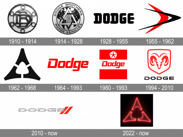
1910 – 1914
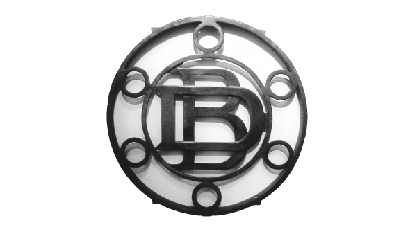
The very first logo of Dodge, created at the beginning of the 20th century, featured the “DB” abbreviation, standing for the original name of the brand, Dodge Brothers. The two capital letters were set in a clean and bold sans-serif font, with the “D” overlapping “B” and enclosed into a circular silver frame with six silver rings around its perimeter.
1914 – 1928
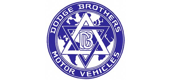
Original Dodge logo was round with two interconnected triangles, a six-pointed star in the center. The initials DB were the center of the star, and the words “Dodge Brothers” were in the circumference of the rims of the mechanical automobile part.
1928 – 1955
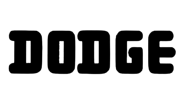
The redesign of 1928 has introduced a super bold and modern Dodge badge, with just a massive black logotype on a transparent background. The inscription was set in the uppercase of a rounded sans-serif typeface, with the letter written in extra-thick lines, and the ends of the bars softened.
1955 – 1962
In 1955 Dodge starts using the Chrysler logo, composed of two horizontally located stylized birds in red and black. The ticks were facing to the right, with the thinner and sharper one in black, overlapping the red one with smoother and shorter lines.
1962 – 1968

The redesign of 1962 has introduced a new Dodge emblem, with an abstract geometric structure, composed of three A-like elements in solid black. The triangle, formed by the small parts, had its sides slightly arched to the center. The badge had no lettering on it and looked very strong and cool for its times.
1964 – 1993
Another badge, used by the American automaker along with the previous one, was designed in 1964 and featured a clean red logotype in the title case of a modern square sans-serif typeface with clean silhouettes and straight cuts of the letters’ lines. The contours of all characters but the “O” were open.
1980 – 1993
The logo, created for Dodge in 1980, used another element of the Chrysler visual identity, the iconic Penta-star. The white pentagon with the thin star in the negative space was placed on the upper red part of the square badge, where the red “Dodge” lettering was written across the wide white stripe in the center.
1994 – 2010
The redesign of 1994 gave birth to the emblem, which stayed with Dodge for more than a decade. It was a red and white crest with the image of the ram’s head enclosed into a medium-thick red frame, and placed above the uppercase black lettering, with the “Dodge” set in a strong and stable sans-serif typeface, and the contours of both “D”s open.
2010 – now
In 2010 the Dodge logo was redesigned again. The new badge features an extended uppercase logotype, written in gradient silver, and overlapping two thick diagonal red lines with the bars of the “E”. The three-dimensional badge is quite minimalistic but looks powerful and stylish.
2022 – now
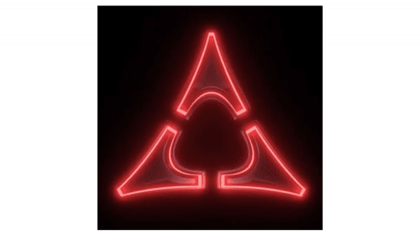
In 2022 Dodge has introduced a new badge. It is a celebration of the company‘s roots, yet at the same time — the depiction of its ability to change and develop. The new logo is based on the Dodge badge, designed in 1962, with the bold triangular formed by three elements. Although, the new version features three elements, outlines in neon-red with blurred contours, and placed on a solid black background. The drawing is the only element in the badge, with no additional lettering.
Font
The bold uppercase logotype from the Dodge badge is executed in a modern sans-serif typeface, with the colors of the letters significantly extended. The closest font to the one, used for the Dodge visual identity is, probably, Vast XXXL Bold.
Symbol Description
In 1994, Dodges again restored the ram’s head on new transport vehicles (on haulage trucks) as an ornament. Gradually the ram heads began to appear on pickups and trucks. From 1996, this symbol was used on all vehicles, except Viper.
 Since 2010, after the separation of the Ram brand, the ram head was removed off the new symbol of Dodge, and the word “DODGE” with 2 skew strips became the new the symbol.
Colors
The silver tint signifies purity, dignity, sophistication, and greatness of Dodge, and the red one symbolizes enthusiasm, energy, intimacy, and excitement.
Emblem
The new corporate style of the emblem is the word “Dodge” and two oblique stripes. The Dodge emblem has a custom-made type of letters.
There is a version that the year 2016 may be the last for the Dodge brand, as the cars of this brand are not going to be in the future model lineup of the group Fiat-Chrysler.
Dodge Ram logo
Dodge Challenger logo
Dodge has manufactured three different generations of automobiles under the name Challenger. So it was only natural that the Dodge Challenger logo has been modified more than once in the course of time. For decades, the cars from the range bore a script “handwritten” logo. Also, there has been a plainer logotype featuring a minimalistic sans serif font.
Dodge Viper logo
The Dodge Viper logo has gone through not less than three modifications, becoming more and more aggressive. The original version, launched in 1992, was nicknamed Sneaky Pete. “Sneaky” seems the right word for the way the snake looks like. The second version (2003) was nicknamed “Fangs”, while the third one (2013) has been informally called “Stryker”.
Dodge Brothers logo
The original Dodge logo adopted in 1914 featured a six-pointed star created by two intertwined triangles. Inside the star, there was a “DB” monogram, which was explained in the text encircling the star. In fact, it has been the only company logo where the words “Dodge Brothers” were mentioned: the following badge (1932) did not contain them.
Dodge Charger logo
The Dodge Charger logo features a simple monolinear sans serif typeface. One of its distinctive features is a delicate balance of rounded and almost right angles. However, the earliest Charger badge looked completely different featuring a handwritten script wordmark.
Dodge Cummins logo
The most well-known product manufactured by the US corporation Cummins, Inc. is arguably the six-cylinder engine installed in the Dodge Ram pickups. The fact the vehicle is driven by this engine is emphasized by the Cummings logo installed on it, in addition to the regular Dodge logo: a bold letter “C” with the company name written across its upper part.

