| Fate | Reincorporated as GM Daewoo after bankruptcy, and replaced by GM Korea in 2011 |
| Successor | GM Korea |
| Founded | 1982 |
| Founder | Kim Woo-jung |
| Headquarters | Bupyeong-gu, Incheon, South Korea |
| Defunct | 2002 |
| Official site | www.daewoo.com |
The amazing integrity of the Daewoo logo allowed the brand to not think about changing it throughout the entire period of the company’s work. And indeed – a harmonious and polysemantic Daewoo logo does not need add-ons.
Meaning and History
According to the decision of the Korean government of 1972, 4 official automakers were determined in the country: Kia, Asia Motors, Hyundai Motor and Shinjin. Very quickly, the first two companies merged under the flag of Kia. But Shinjin, on the contrary, was divided into Daewoo and General Motors, which, however, cooperated for quite a long time – until about 1993, when their ways finally parted. To be more precise, the ambitions of each enterprise have outgrown the opportunity to share markets with competitors.
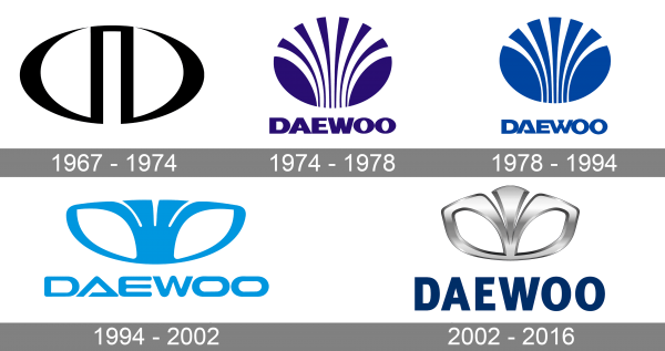
1967 – 1974

The original Daewoo logo was introduced in 1967, and stayed with the company for good seven years. It was a very minimalistic abstract emblem in black and white, with no additional lettering on it. The emblem featured a shape of a horizontally printed oval, cut in the central pint of the bottom border, and creating a rectangular arch inside the badge.
1974 – 1978
The redesign of 1974 created a new badge for the automaker, and this Daewoo shell emblem has become iconic in no time. The new badge features a rounded emblem in a calm purple shade, with the circle composed of several slightly curved lines, which created that famous “shell” pattern. The uppercase sans-serif lettering was set under the graphical element and used the same shade of purple for its characters.
1978 – 1994
The Daewoo logo got refined in 1978, keeping the idea of the previous version, but switching its color to calm blue, changing the typeface of the inscription, and reducing the number of “rays” in the shell emblem. The new font of the logotype had some sharp elements and diagonal cuts of the bars, which balanced the softness of the graphical part, adding that edgy and progressive feeling to the whole badge.
1994 – 2002
Since the 1990s, Daewoo has been actively promoting its own developments, both in Asian and European markets, and the Daewoo logo has become more recognizable both in the professional community and in the markets in general.
2002 – 2016
However, in 2002 Daewoo became a division of General Motors and changed its name to GM Daewoo Auto & Technology Co. However, the owner did not change the logo. GM appreciated the laconic, elegant and, most importantly, more than recognizable Daewoo logo, and saved it.
“Daewoo” is translated from Korean as “The Great Universe”. And the center of this universe is naturally South Korea. That is why the symbolic image of the company is a sea shell, which in the worldview of the Koreans is almost an ideal image of the “beginning and end”.
Symbol
A sea shell was chosen as the symbol of Daewoo. Ofcourse, the image was maximally stylized in order to ensure the brevity of the logo, make it easier to perceive. Minor graphic changes in the logo did not affect its symbolism in principle.
However, European consumers at first perceived the logo rather as a “flower”, so even official explanations from the brand management were required. The symbolic significance of the shell in Eastern culture is much deeper and has a philosophical connotation
Font
The font takes up an insignificant place in the structure of the Daewoo logo. Nevertheless, the brand had to use it. The font has a universal character, without accents to sharp corners or excessive smoothness. Such a font is easy to read, and is an additional confirmation of the brand’s stability, as well as the safety and comfort of its products.
Color
Since Daewoo is a relatively young brand, it did not experiment with color logos. The main color in the logo is silver, chrome-plated image of the sea shell. As for the logo, it is made in a dark blue with a gray outflow of color solution.

