| Founded | 1989 |
| Founder | Dan Panoz |
| Headquarters | Braselton, Georgia, United States |
| Slogan | “America’s Most Exclusive Custom Sports Car” |
| Official Site | www.panoz.com |
| Official Facebook Page | www.facebook.com/panozllc |
Originally oriented on tuning, American company Panoz reoriented to develop cars under its own brand quickly enough. They became one of the most authoritative manufacturers of racing cars.
History
The founder of the company, Dan Penoz, spent several years working in the racing business of Penske. After leaving the team, he founded his own company Panoz, developed the original chassis for racing cars Mazeratti and Alfa Romeo. It took 4 years from the registration of the company and the release of the first car with the Panoz logo.
Symbol
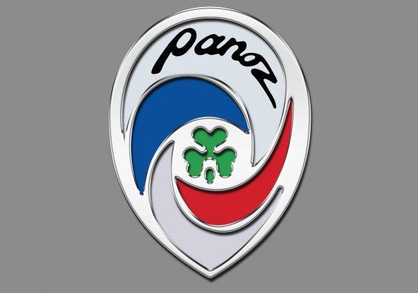
The symbol of the brand was a cloverleaf, sending a careful researcher of heraldic symbols to the Irish roots of the company’s founder. As you know, the clover is a symbol of St. Patrick, the patron saint of Ireland (as well as pre-Christian characters, leprechauns, custodians of underground treasures). Continuation of the theme of “leaves” and secrets – in the arrangement of elements that make up the logo.
Additionally, there is an opinion that the more famous symbol “Yin-Yan” is encoded in the Panoz logo.
The image itself is located in a highly stylized form of the emblem, which, however, after the transformations, is more like the sign “beginning / end of the route” on electronic maps.
Emblem
Contrary to the classic round shape of the emblem, the designers developed a more classic, yet modern version of the logo. The rounded upper part of the emblem contrasts with the sharpness of the lower one, whereas the circle, though not explicitly expressed, is the logical center of the aesthetic composition. Clover leaf is in the center of the composition, in one of the “petals” surrounding it – a stylized and somewhat “greased with speed” brand name.
Font
A curved, according to the element in which it is inscribed, font of dark gray or black is in the logo itself. Originally it was planned to use a pseudo-calligraphic version of the font, but a handwritten form similar to a simple one turned out to be the most harmonious for the overall idea of the Panoz logo.
Color
Being in some way a revolutionary, the Panoz logo used colors that are usually not combined in such designs. Those are white and silver. Formally, 6 colors are involved in the image, which is too much for a simple logo. However, the company motivated such a color saturation by the fact that the basis is silver (nobility and aristocracy), white, red and blue – the colors of the American flag, and green – freshness and novelty.
The brand Panoz was almost the only company that entered the international automotive (in particular, the racing) market in a revolutionary way. A young manufacturer who immediately after the development of the chassis introduced the whole racing series American Le Man Series, conquered fans of professional races.

