| Founded | 7 March 1916 |
| Founder | Franz Josef Popp Karl Rapp |
| Headquarters | Munich, Bavaria, Germany |
| Slogan | “Sheer Driving Pleasure” (Worldwide) “The Ultimate Driving Machine” (United States, United Kingdom) “The Ultimate Driving Experience” (Canada) “Freude am Fahren” (Germany) |
| Subsidiaries | Rolls-Royce BMW M Mini |
| Official Site | www.bmw.com |
| Official Facebook Page | www.facebook.com/BMW |
BMW is an abbreviation, standing for the Bayerische Motoren Werke, one of the most famous German automaking brands, which was established in 1913, and by today has grown into a huge group, owning several subsidiary car marques.
Meaning and History
Not all enterprises of automobile industry were immediately built as car manufacturers.
Some of them began with spares, the others – with bicycles and motorcycles, the third ones– with aircraft engines and the first planes of aircraft. At the end of the ХIХth century- the beginning of the XXth century, an airplane, a car, and a motorcycle were exotic and expensive to an equal extent, but automobilist themselves (reading: car racers) were not less glory than airmen.
There is a brand, the aviation origin of which is carefully disguised – it is BMW. The circle divided into four sectors represents nothing else but a rotating propeller: originally, the company was manufacturing aircraft engines.
BMW (abbreviation of Bayerische Motoren Werke AG, “Bavarian engine plants”) is a German car, motorcycle, engine, as well as bicycle manufacturer.
Several «unofficial» names also exist: for firm motorcycles the name “beemer” is historically used, the similar one, but a little unequal «bimmer» is used for the cars. There is a name «beba» in Greece, and “BM” – in the Arab countries, the vehicles can also be called respectively to their series, for example for the 5th series – “the five.”
The company was created in 1916 in Munich in the merger of two small enterprises – Rapp-Flugmotoren Werke and Otto-Werke, which had been manufacturing engines for aviation since 1913.
BMW proceeded for the motorcycle and motor vehicle manufacturing not at its will. After the end of the First World War, the firm found itself on the doorstep of a collapse: Under the Versailles peace agreement, the Germans were prohibited from manufacturing engines for airplanes and engines were the only BMW’s production in that time. Because of that the plant had to be converted for a production of engines of a motorcycle first and then of the motorcycles themselves. In 1923 the first R32 motorcycles went on sale and in 1928 – the cars of the British brand Austin produced on a license. Let first one hundred of Austen’s were produced with the right wheel, but after a purchase of plants in Eisenach, BMW starts production of a compact Dixi, a car adapted to conditions of Germany. Motor vehicle manufacturing was organized on a conveyor and only the company “-Benz Daimler” could boast it then. 15 000 Dixi cars with the right steering wheel became the first own model of the BMW brand: Since the 16th of November 1928, the brand name of Dixi was replaced by BMW. After the Second World War, the history repeated: Since 1946, already the English aviation firm Bristol copied and launched production of a model of BMW-327.
Besides the logo, BMW cars have another typical feature as well – a radiator grill in the form of two rounded quadrangles, which has not changed in several decades. Such a grill organically matched with an outline of elegant lines of all hoods of prestigious BMW cars indicates the extraordinary status of a car owner on and on from far, which allows all the rest of the car owners to clear a road in time.
Now BMW is one of the largest carmakers, which produces cars, sports cars, off-roaders, and motorcycles. Since 1936, when the famous 2-door and too terrain BMW-328 fit with a 6-cylinder engine and having accelerated to 150 km/h ran away from the conveyor, finally formed the major principle of BMW still defining the concept of new models: “A car for a driver.” Norbert Raitkhofer today is the chairman of the company, and Karim Habib is the chief designer. The motto of the company is «The Ultimate Driving Machine” and “Sheer Driving Pleasure.”
1913 – 1917
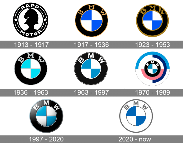
The very first BMW logo was introduced in 1913 and stayed with the German automaker for four years. That was a monochrome roundel, with the thick black frame and the chess horse in black, set on the white background in the center. On the framing, there was a white sans-serif “Rapp Motor” lettering set in the uppercase, with the two parts of the inscription separated from each other by thin white lines and two white five-pointed stars.
1917 – 1936
With the beginning of the First World War, the number of orders for aircraft engines sharply increased, and the companies decided to join. A rotating propeller was depicted on the first emblem accepted in 1917. However, the emblem seemed too complex and small, and by 1920, the propeller was strongly stylized. The circle from a propeller was separated into four quarters; the silver-white sectors inside a black rim began to alternate with the blue ones. These colors turned out much more important than the colors of the steel and sky: a white and a blue one are traditional Bavarian colors; there is a blue stripe down and the white – above on the flag of Bavaria. The emblem of Bavaria itself is formally described like that: “the shield crested with a crown is with a brim, fusiform – painted in silver and blue,” in other words, it is covered with white and blue rhombuses. The insignia of this emblem, which first belonged to the Counts von Bogans who lived near Regensburg until 1242, is not clear. When the kindred died out, their possessions and the emblem borrowed Vittelsbakhi that were found with them in nepotism kinship, and a little later the emblem became a symbol of all Bavaria. White and blue rhombuses can still be seen on bottles of famous Bavarian beer. The logo turned simple and easily memorable, and blue, gray and black tints are still corporate colors of the concern.
1923 – 1953
The redesign of 1923 has emboldened all the gold elements of the BMW badge, including the lettering, outlines of the free, and the separation lines, With the bolder gold contouring, the logo started looking brighter and sleeker.
1936 – 1963
In 1936 the BMW logo was redesigned again, and this time the golden elements were replaced by light silver ones, and the main blue shade was changed to a sky-blue, close to turquoise.
1963 – 1997
The redesign of 1963 has refined the iconic BMW badge, changing the bold serif font into a modern sans-serif, refining the contours of all elements, and balancing the color palette, by replacing the shade of blue with a calmer one. This version of the badge has stayed with the company for more than thirty years.
1970 – 1989
In 1970 the BMW badge gets another redesign, with the iconic blue and white rondel, enclosed into a thick black framing, being set on a larger circle with a colorful white, pink and blue background, formed by several arched lines with straight cuts of the ends.
1997 – 2020
In 1997 the BMW badge gets three-dimensional. It was fully based on the logo from 1963, but with some additional black lines for the central part, some gradients on both the “propeller” and the frame, and more silverfish gloss on the sans-serif “BMW” lettering on the upper part of the frame.
2020 – now
The redesign of 2020 has made the BMW logo super simple and minimalistic. The three-dimensional badge got replaced by a flat one, and the black framing is now white. All letters and outlines are nowise in gray, which looks calm ad professional. As for the central part of the logo, it remained untouched and is still composed of four fragments in blue and white.
Description
A rotating propeller was depicted on the first emblem accepted in 1917. Nevertheless, the emblem seemed too complex and small, and by 1920, the propeller was strongly stylized. The circle from a propeller was divided into four quarters; the silver-white sectors inside a black rim began to alternate with the blue ones.
BMW’s two-color firm insignia have not undergone serious changes in all the ХХth century. The latter one, which affected the only font of the BMW letters, refers yet to 1963. In the 70-80 years, the logo was a little changed – the rim was painted in other colors. At that time, the rim was as a bearing with three tubes, half of each chamber was white, half – dark-blue, blue or pale-red.
Now the emblems, which appear on all motorcycles and company’s cars, are identical with a traditional variant of the logo.
Font
The simple yet confident lettering on the top part of the BMW badge’s frame is set in a modern sans-serif typeface with wide contours of the letters, ad bold lines. It is a pretty standard font, which looks close to Rleud SC Bold or Tioga Bold fonts.
Colors
The myth on the logo created by quick German marketing specialists fooled several generations, having tied a white-blue circle to aviation. The German advertising agency in the 1920s created advertisements, which showed a BMW circle opposite a rotating airplane propeller and thus reflected the origin of a company as a manufacturer of aircraft engines. And then it turned into a myth. Even though engines for airplanes were being manufactured by BMW, the white-blue logo pictures the colors of a Bavarian flag, but not the propeller and the sky.
The colors of the logo turned out much more important than colors of the steel and the sky: a white and a blue one are traditional Bavarian colors; there is a blue stripe down and the white – above on the flag of Bavaria. The emblem of Bavaria itself is formally described like that: “the shield crested with a crown is with a brim, fusiform – painted in silver and blue», in other words, it is covered with white and blue rhombuses.
The insignia of this emblem, which first belonged to the Counts von Bogans who lived near Regensburg until 1242, is not clear. When the kindred died out, their possessions and the emblem borrowed Vittelsbakhi that were found with them in nepotism kinship, and a little later the emblem became a symbol of all Bavaria. White and blue rhombuses can still be seen on bottles of famous Bavarian beer. The logo turned simple and easily memorable, and blue, gray and black colors are still corporate colors of the concern.
Early evolution symbol
Although the structure of the logo stayed the same for almost a hundred years, it is possible to notice subtle alterations. The very first version with gold lettering and outline was changed by 1923: the font grew bolder, and letters moved closer together. The proportions of the BMW symbol were changed several times, as well as the shade of blue. In addition to gold, the company used white and silver letters. It also varied the size of the font.
Evolution emblem after 1950
In the 1950s, the car maker made an effort to standardize its logo. White letters were used for advertisements, while the version that is installed on cars and motorcycles used silver lettering. By 1966 the company’s designers got rid of the serif font, so all the motorcycles manufactured at that time feature a sans-serif font. Since 1997, BMW emblem used in ads has been depicted in 3D.
Logo BMW M
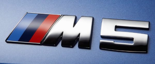
BMW M is a subsidiary that deals with specially modified higher trim models. Originally it was created to facilitate the auto maker’s racing program. In the early 1970s, a MotorsportRoundel was introduced, and there were several alterations over the following decade. BMW M logo looked almost the same as the standard version but was surrounded by the Motorsport colors.
BMW M5 logo
BMW X5 logo
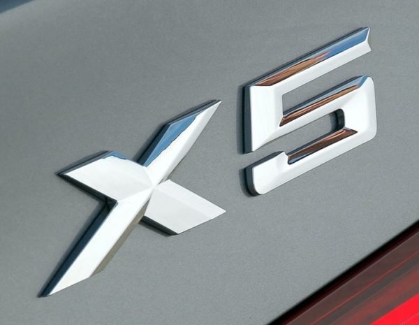
The mid-size luxury SUV was launched not long before 2000. Initially, these cars used the chassis code E53, but the second generation, which was unveiled in 2006, is known as the E70. Cars from this lineup are produced in Greer, South Carolina. The modern and minimalistic BMW X5 logo features silver lettering. Designers chose a simple sans-serif font for this range.
BMW i8 logo
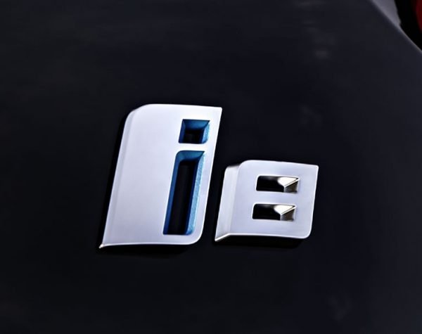
The plug-in hybrid is the production version of the Vision Efficient Dynamics concept. It is marketed under the BMW i brand, which is a sub-brand that focuses on plug-in electric vehicles. The BMW i8 logo features the name of the range. In addition to silver elements, it also uses the blue color, which appears to be the same shade that is used on the standard BMW Roundel.

