Founded: 1911
Founder: The Benelux Family
Headquarters: Pesaro, Italy
Official website: www.benelli.com
Benelli is the name of one of the iconic European motorcycle manufacturing companies, which was founded in 1911 in Italy and is rightfully one of the oldest bike manufacturers in the world. It all started with a motorcycle workshop where exclusive parts for bicycles and motorcycles were produced.
Motorcycle History
The first 75 CC two-stroke engine was introduced by the company in 1920. It was adapted to be mounted on bicycle frames. The model was constantly upgraded and in 1927 — 1931 won many Italian championships.
Right before the war, Benelli produces a four-cylinder motorcycle with a 250 CC engine. After the war, in 1951 the brand introduced a wide range of light 98 and 125 CC and heavy motorcycles, 350 and 500 CC.
In 1962, Benelli bought the Motobi brand, which increased production capacity and the number of employees.
In 1969, the model Benelli Tornado 650, popular in the USA and UK, was produced. It was distinguished by a combination of dynamic performance, reliability, and a top speed of about 180 km/h.
In 1973 Benelli designs new models of motorcycles — 350 Quatro and 500 Quatro. The 1980s became a hard time for the brand.
At the end of the 1990s, the company began a revival, releasing successful models such as sports bike Benelli Tornado 900 and TNT series.
Today Benelli is owned by the Chinese Qianjiang Group and produces a wide range of motorcycle equipment, from small scooters to powerful road bikes. At the moment Benelli brand production is concentrated in China, managed by a team of Italian engineers. Thanks to European technology and Chinese production, the line of motorcycles pleases customers all over the world.
Brand Logo
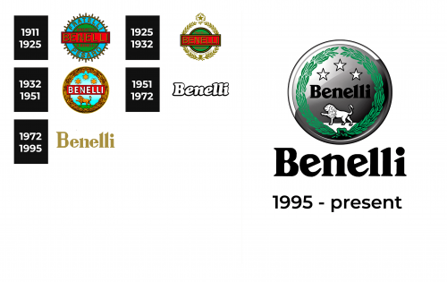
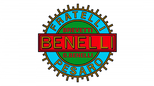
1911 – 1925
The early version of the Benelli logo is bright and colorful. The name is printed in golden with a black outline and placed on a red rectangular banner with several border lines. A sky blue gear with a golden outline was added in the background. The blue portion had “Fratelli Pesaro” printed using the same golden font only slightly smaller characters. The founder’s name is also present in the logo. The emblem turned out bold and surely caught the attention.
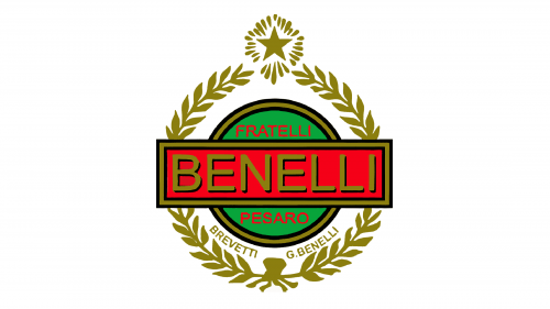
1925 – 1932
The blue border along with the gear pattern was replaced by a golden laurel wreath, which is the symbol of triumph. A golden star completed this new look and enhanced the company’s strive to be the best. The green portion along with the red banner remained unchanged, which made the logo instantly recognizable.
1932 – 1951
This is another quite busy, yet very interesting logo of the brand. It still has a laurel wreath, although the latter was redrawn. The most prominent element of this logo, though, is the lion walking on green grass with a blue sky in the background and three stars at the top of the sky. Besides the brand name on the black banner, there are no inscriptions. Despite having a very different look than the original logo, this design still carries the elements that the brand is recognized for.
1951 – 1972
A drastic change was made in 1951 when the company introduced a very minimalistic look. The logo consisted only of the name. The colors were also gone as the name featured white characters with a black outline, which made the inscription resemble a cloud-like emblem. The company went for bold, rounded, cursive letters with the first letter being capitalized.
1972 – 1995
The golden color has already been used by the company in earlier logo designs, but this time its appearance contributes to a more sophisticated and luxurious brand image. The company continued to use its name without any embellishments. The new font choice gave the logo a more stylish and progressive feel as it featured pointed ends, serifs, and generally square font.
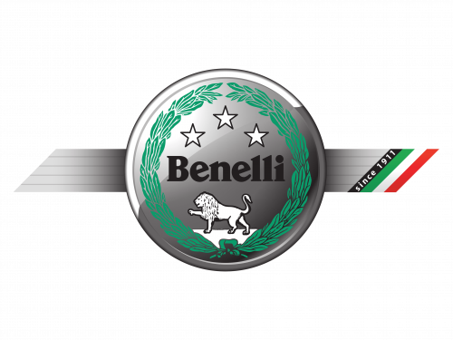
1995 – now
The company returned to its roots by taking the logo designed in 1932. To make it look more modern, the designers limited the color palette to green, black, and metallic silver gradient. The name was no longer placed on a red banner but simply printed across the round emblem using a serif font that had the same feel as the font in the previous logo. The same inscription was also done underneath the round emblem, only using a larger font size. The logo turned out very professional and had a more calm and grand appearance.
Emblem and Symbol
The Benelli emblem is a light gray or silver circular medallion with a green wreath around its interior perimeter. Inside the green ornament, there is a white lion placed on the bottom part of the badge, the black “Benelli” lettering in a custom typeface, and three white stars arched above it.
Font and Color
The Benelli logotype in the title case is executed in a sleek and smooth typeface with delicate serifs and diagonal cuts of the letters, with their angles softened. The type of the Italian brand’s visual identity is pretty close to such fonts as Bookmania Black and Verona TS Bold, with just some lines modified.
The color palette of the Benelli logo is composed of black for the wordmark, and a combination of silver, green and white for the badge, which also has some black details. This color scheme evokes a sense of expertise and authority, showing the brand as a professional one. Green stands for growth and success, while white points in the brand’s values of loyalty and transparency.
The Legends
The two main bikes of the brand’s portfolio are Benelli TNT and sportbike Benelli Tornado. The Benelli Tornado is the only production motorcycle in the world with a radiator under the seat, allowing airflow through the two dynamic tubes at the front of the motorcycle.

