Founded: 1863
Defunct: 1972
Headquarters: Birmingham, UK
BSA is the name of one of the world’s oldest motorcycle manufacturing brands, which takes its roots from the middle of the 19th century when un was established in Britain as a manufacturer of small arms. The history of the famous brand began during the Crimean War of 1853-1856. As Britain was directly involved in this conflict, the increased demand for weapons, resulting in the formation of the “Birmingham Small Arms Manufacturers’ Association”. In 1861 this union was transformed into a joint-stock company called the Birmingham Small Arms Company, and three crossed rifles were chosen as the emblem.
Motorcycle History
In 1963 a small factory was established in Small Heath, based on which the BSA company was born. However, the first bicycles were not produced until 17 years later. And in 1881 the company began its first independent project. For the long 12 years, attention was again focused on weapons. It was not until 1893 that the company returned to the production of components for bicycles, and a few years later for motorcycles. This lasted ten years.
In 1903, the assembly of motorcycles began, based on parts supplied by various firms. In particular, the Belgian company Minerva took over the supply of engines. It was only in 1909 that BSA created its motorcycle. Though right at this time all plans were disrupted with the outbreak of World War I. The motorcycle manufacturing process had to stop, not even starting properly.
The company recovered after two wars, and in 1958, the production of single-cylinder motorcycles, such as the C15 with OHV engines, began. This model was originally conceived as a suburban motorcycle but was later superseded by another machine, the B25 Barracuda. Beginning in 1965, BSA produced several sport-inspired models. These were the A65R, Cyclone, and Lightning, which went to the domestic market, and the Wasp and Hornet for export. The Spitfire Mk II also appeared in 1965, along with its modifications Mk III and Mk IV, but in 1969 they were taken out of production.
But in the 1970s the motorcycle market was gradually filled with Japanese bikes, so it got harder to compete. This is when BSA took up the development of the Rocket III. It is believed that this model is a development of the two-cylinder Triumph. Several of these machines were sent to the United States, where they were appreciated by the public. The Rocket III model motorcycles raced twice at Daytona. In 1970, the results were not bad, but the first place was rightly won by Honda. But a year later, the Rocket III bikes took the entire podium.
It was the last success of the company. Moreover, these were the last years of existence for many brands, including BSA. Norton and BSA were bought by the major firm Manganes Bronze. And stayed in stagnation for years. Today BSA is owned by the famous Indian Mahindra Group.
Brand Logo
The visual identity of BSA hasn’t changed much throughout the years, just one big redesign happened at the beginning of the company’s existence when the direction was changed from firearms manufacturing to bicycles and motorcycles. The very first emblem featured an image of two crossed rifles, and this sting and the confident mood was kept in the new version, though the style was changed completely.
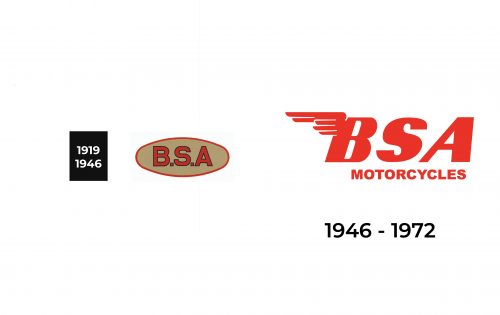
1919 – 1946
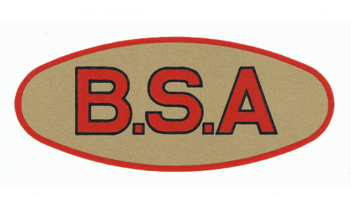
The logo of the brand was quite minimalistic and simple in its early years, which allowed for the emblem to be easily remembered and recognized. The logo consisted of a sand-colored oval shape with a red border. This muted red color was also used for the “B.S.A” inscription in the center. The font was quite simple without serifs. To make each character stand out, the designers added a thin black outline.
1946 – 1972
The updated logo looks a lot more stylish and well-designed. There is no more oval base, but the red emblem stands out perfectly on any background. The font was changed to another bold, italicized, sans-serif font. The company also added a second line that said “Motorcycles” using a basic, sans-serif font and all uppercase letters. However, the logo was recognized for a different element – the wing. It was added in the upper left corner to the letter “B” and added not only a unique touch but also dynamics. The logo looked bold and reflected the solid position of the brand.
Emblem and Symbol
The red-winged BSA inscription was the main part of the brand’s emblem, standing for speed and motion, and symbolizing freedom and a very special biking spirit. Though it was the most important element of any badge, the lettering could be accompanied by fancy and bold frames in various shades of gold. The shape of the frames usually resembles a star or the sun, being elegant and bright.
Font and Color
The BSA logotype is set in two levels, with the main part of the inscription enlarged and italicized. Besides the first “B” with the wing, two other letters look very traditional and confident, executed in bold sans-serif typeface which is pretty close to such fonts as Kiez Slanted and Indecise Semi Expanded Bold Italic. As for the “Motorcycles” tagline, it is written in all capitals of a strict and simple sans-serif, similar to Arial Std Black and Sequel Sans VF Head Black.
The color palette of BSA is based on a bright and intense shade of red, which is usually placed on a white background, balancing the white elements in the wing. The red and white combination stands for strength, passion, and determination, showing the character of the brand and its main values, while white elements represent loyalty and reliability.
The Legends
BSA motorcycles participated in all kinds of exhibitions and championships. For example, the BSA A7 with a 500 CC engine was presented in 1947 in Paris. A year later at the next show, the audience saw the new conceptual Bentem. It was a development of the project DKW-RT125, which was equipped with a 125 CC engine and some other features which made it the best-selling British motorcycle in history.

