| Founded | 24 January 1884 |
| Founder | Rinaldo Piaggio |
| Headquarters | Pontedera, Italy |
| Parent | FCA Italy |
| Official Site | www.piaggiocommercialvehicles.com |
| Official Facebook Page | www.facebook.com/piaggio |
The Italian company Rinaldo Piaggio SPA started its production activity with the creation of small light-engine aircraft. Several models were produced serially, but for this was completely useless in terms of economic success of the company, so the company’s management decided to switch to automotive production.
Meaning and History
The company was founded in 1884, and it was then engaged in the creation of railway equipment, as well as ocean ships. In 1906 the company built its own factory for the development of aircraft engines. In 1920, the company took up serial production of aircraft, developed its own model of a vertical takeoff (helicopter) aircraft. Even during the Second World War, the company developed and started production of Vespa scooters, designed for both men and women, taking into account the characteristics of clothing of both sexes. Thanks to this versatility and affordable price, over a million motor scooters were produced in just 10 years.
Being a manufacturer of aircraft, the company’s concern was not to create a recognizable logo, but switching to another commodity group required to design a memorable visual sign. When choosing the optimal solution, the company was guided by minimalism and practicality. In fact, these same principles are laid in the very ideology of the manufacturer. At the same time, special attention is paid to aerodynamics, because the company still has airspace production.
1946 – 1964
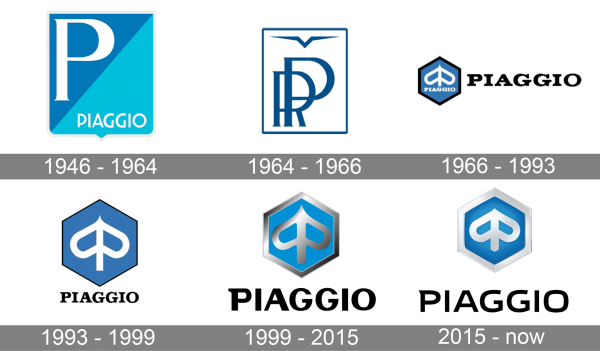
The Piaggio badge, created in 1946, featured a bright square shield badge, diagonally divided into two fragments: the left triangle in calm blue, and the right one — in bright. The enlarged white capital “P” was written in a bold sans-serif font on the darker part of the badge, while the light triangle had a complete wordmark written at its bottom in lightweight white lines of a modern sans-serif typeface.
1964 – 1966
The redesign of 1964 introduced a completely different logo, with the “PR” monogram in elegant blue lines set against a white background and enclosed into a square frame. The monogram was accompanied by a stylized geometric bird, laced above it, inside the frame. All the elements of the badge were set in one shade of blue.
1966 – 1993
In 1966 the Piaggio logo gets another redesign. Now the badge was composed of a hexagonal emblem in solid blue, with a black frame, a white symbol, looking like a heart turned upside-down, crossed by a vertical line, and a white uppercase logotype set under it. The black lettering was sometimes used with the emblem, set in bold black capitals of a smooth and heavy serif font.
1993 – 1999
The redesign of 1993 has simplified and cleaned up the Piaggio badge. The blue emblem was enlarged, with its black framing getting thinner. The lettering was removed from the graphical part and got placed under it, rotten in the same font, but with thinner and more delicate lines. This badge stayed with the Italian company for almost six years.
1999 – 2015
In 1999 the Piaggio badge becomes three-dimensional, with the blue hexagon gaining a gradient silver frame. The symbol on the medallion also became silver and got its lines emboldened. The black lettering under the emblem was enlarged and changed its typeface to a modern and sleek sans-serif one. The color of the inscription remained the same.
2015 – now
In 2015 the badge got refined, with all silver shades getting lighter, almost white, but still with gradients and gloss. This made the emblem look a bit smaller, and gave more space to the logotype, which is written in black under the blue hexagon. The inscription has changed its typeface to a smoother and wider sans-serif, which looks very contemporary and stylish.
Emblem
The center of the Piaggio emblem was the large letter R. With the help of such a simple emblem, the brand’s creators emphasized that the manufactured car was oriented to the widest audience, and its main task would be practicality. The availability of cars at a price also played an important role in the main idea of the brand.
Nevertheless, the brand took the shield as the basis of its emblem, and, therefore, referring to history and traditions, as well as to future victories. However, later the shield, although stylized, had to be dismissed, and the logo was changed. Today the form of the logo is more like an octahedron, in which there is a strongly stylized letter “P” with its reflection.
Symbol
Symbolic of the Piaggio logo is especially relevant today. So, having abandoned the form of the shield, on which the image and name of the brand were actually painted, the company declares its democratic approach to solving any, even the most complex technical (and not only technical) issues. Styling the logo made it look more like an ancient bow, and purposefulness is emphasized by a narrowed point pointing upwards. The new symbol of Piaggio is the symbol of the winners.
Font
During the existence of the brand, the font used in the logo has changed many times. Initially, the font was secondary, performed only an auxiliary function. This determined the attention of designers to this element of the brand. After changing the logo, the font acquired great thoroughness, harmony and originality
Color
The brand color of the Piaggio brand is blue. They chose blue color as a solution for the logo, and in the event that only the brand name is used, it is also in blue. The image is white (in the heraldic sense – silvery, the color of success and direction in the future).
Official Piaggio website:


