Founded: 1898
Relaunched: 2008
Founder: James Lansdowne Norton
Headquarters: Leicestershire, England
Official website: www.nortonmotorcycles.com
Norton is the name of one of the world’s oldest motorcycle manufacturing brands, which was established in the United Kingdom in 1898 and named after its founder, James Lansdowne Norton. The company was closed for several years but was brought back to life in 2008.
Motorcycle History
The company, established in England in 1898 started the production of motor vehicles only four years after, in 1902. The motors for the first Norton bikes were supplied from France and Switzerland.
The name of the brand, Norton, became famous after the motorcycle racer Rem Fowler took a victory in competitions on the company’s motorcycle. This gave rise to the sporting future of the brand, along with all the future wins (Norton motorcycles won the most prestigious races more than ten times).
Unfortunately, winning the competition did not bring sufficient dividends, the financial state of the company was not stable, the corporation could not operate fully, and the demand for the products fell. As a result, in 1953, the company was bought by Associated Motorcycles (or simply AMC).
In 2008 the legendary brand was revived and introduced its sample vehicles in the same year, in Austria. The motorcycles were officially presented at the Bike-Austria motorcycle exhibition in Tulln a der Donau.
Today the revived Norton produces beautiful and exclusive machines, and all production facilities of the brand are located in its historical homeland, in England. All the vehicles are handmade, which does not allow to release of bikes in large quantities, though exclusiveness raises the value of the Norton motorcycles. The bikes are known for their classic design and use of the best manufacturers’ details, such as Brembo brakes and Ohlins shock absorbers.
Brand Logo
1902 – 1913
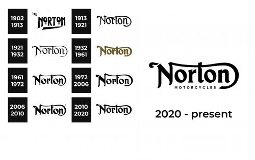
From the very start, the company went for a rather simple, black-and-white logo that featured only the name. The original logo also had “The” in front of “Norton”, which was later removed. Bold strokes with flared serifs gave the logo a strong and solid look. The two letters “O”, which were made smaller and placed at the top instead of being centered, added a unique touch. A thick line with a pointed end underlined the name and completed the overall look.
1913 – 1921
This logo introduced a drastic difference in the logo style. A bold, chunky inscription was replaced by an elegant and luxurious wordmark. The name had only the first letter capitalized and featured a beautiful stroke that started from the top of the “N” and curved under the name, becoming a horizontal bar in the letter “t”. Just like the earlier version, this logo has no other elements.
1921 – 1932
It might not be obvious right away that the company made any modifications to its logo. However, when two versions are set side by side, one will notice that the strokes are much thinner and there is more contrast in the stroke thickness. This was an excellent update to a logo that became closely associated with the brand.
1932 – 1961
The black color was replaced by a greenish-golden color with a thin golden outline. The font has been changed and no longer looks as refined. The thicker lines of the letters gave them more weight and allowed the logo to be more visible. The new logo seemed to be a better match for powerful motorcycles created by Norton. This logo was used by the company for almost thirty years, which proves that this design was quite successful.
1961 – 1972
The company decided to bring back the black and white color palette, giving its logo a classic look and reflecting the long history of the brand. Although the overall look of the emblem has not really changed, an attentive eye will notice several differences in the way it is written. The swoosh line, for the first time, is no longer a horizontal bar of the “t as the latter now had a short line crossing its top.
1972 – 2006
It seems the brand never ceases to improve its visual identity. Some minor changes to the logo were introduced in 1972. Some of the strokes’ ends were made round, while the others got a sharp diagonal cut, which created an interesting contrast in the same emblem.
2006 – 2010
The changes done this time are also quite minor. In fact, the company simply brought back the logo it presented back in 1961 and used it for a little over ten years without any modifications. It was a good move to bring back a logo that earned recognition.
2010 – 2020
This time, the company also did not create any new designs. It went back to the earlier logo versions and presented the 1932 logo in black. There was no reason to design something completely new, but the introduction of a different version still attracted more attention to the brand.
2020 – now
The visual identity of Norton hasn’t changed much since the introduction of its first logo version. It is still the same monochrome logotype executed in a custom typeface, just with cleaned and emboldened lines and contours, which look modern and sleek today.
The most interesting thing about the logo of the British motorcycle manufacturer is a bold and sharp horn, placed in the left from the first letter of the inscription, and the elongated tail of the same letter, coming above the whole wordmark and curving under the last “N”.
Font and Color
The Norton logotype is executed in a custom typeface with the letters having its lines bold and smooth. The elongated lines and slightly curved edges make the lettering look playful and fancy, creating a unique character of the brand and making the logo memorable and recognizable.
The closest font to the one from the Norton visual identity is probably Absinette, but with its lines and contours modified.
As for the color palette, Norton drawn its logo in black and usually placed it on a white background. The timeless combination makes it look elegant and powerful at the same time.
The Legends
The Norton most famous classic motorcycle was first manufactured in1967 and is still being produced by the brand today. Its name is known all over the globe — Norton Commando. Though its release was not easy for the company.
Norton had no money to develop a new motorcycle with a big 750 CC engine. But there were big human resources of the new owner of the brand, AMC. And there was already one 750 CC engine — from the not popular model for the American market, the Norton Atlas. The model was not successful because of the high price and great vibration from the badly balanced inline two-cylinder engine.
Former Rolls-Royce engineer Stephan Baer and Norton-Villiers chief engineer Bernard Hoper took over the design and production of the new model. They isolated the engine, gearbox, and rear suspension from the rest of the frame with a system of rubber elements. This helped solve the vibration problem. This system was called Isolastic.
The result was the Norton Commando, which blew up the market. From 1968 to 1972, it won the “Motorcycle of the Year” award of the prestigious British magazine Motor Cycle News. The model was produced in various modifications. Among them was a police model, called Interpol.
The racing version of the Norton Commando had disc brakes, forced engines, and a bright and delightful yellow color, and therefore were called Yellow Peril.

