| Founded | 2010 |
| Headquarters | Liuzhou, Guangxi, China |
| Parent | SAIC-GM-Wuling Automobile, joint venture between General Motors, SAIC Motor and Wuling Automobile Company Limited. |
| Official Site | www.autobaojun.com |
As the name of the Chinese carmaker Baojun means “Treasured Horse,” it’s only natural its logo features a horse, a long-standing symbol of speed and freedom. In addition to the main logo, the company also has a different version for its premium models.
Meaning and History
The brand was created in 2010 with the aim of manufacturing cheaper alternatives to such cars as Chevrolet and Buick. The brand became commercially successful very soon, and its sales plummeted during its first years – in 2016, it sold over 685,000 units, while in 2017, it sold more than 995,000 units. Baojun is a joint venture of such automobile giants as General Motors and SAIC Motor, SAIC-GM-Wuling Automobile.
2010 – 2019
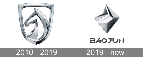
The Baojun logo, designed in 2010, featured a glossy three-dimensional crest in silver-metallic, with a stylized abstract image of the horse head, enclosed into a frame of a traditional shield, with a transparent background. The horse was facing to the left and had its ear executed as a sharp triangle with the right side slightly arched. There were no additional colors or elements on this logo.
2019 – now
The redesign of 2019 made the three-dimensional Baojun logo more abstract and matte and added a gray logotype of the company under it. The emblem was now composed of two elements — a voluminous rectangle in the upper left corner, and the large geometric element, repeating the contours of the smaller element, and forming a rhomboid shape with it. As for the text part of the badge, it is executed in a custom futuristic font, which reflects the progressiveness of the company.
Main logo
The primary badge is basically a shield with the horse’s head inside. The horse looks quite realistic. The designer managed to catch the noble and free spirit characteristic for the animal. Interestingly, the head is facing to the right. That’s quite unusual: most brands prefer logos facing to the left as they convey the idea of embracing the future. The only color used on the Baojun logo is silver.
Color
The Baojun badge is executed in a gray color palette, with lots of silver gradients in the emblem, and one flat medium-gray shade in the lettering. Gray is the color of professionalism and confidence, while it is pretty common to use it for automobile badges. It evokes a sense of reliability and trustworthiness, showing the company at its best.
Font
The futuristic and edgy wordmark on the Baojun logo is set in a custom geometric typeface with sharp elements. The font of the automaker’s badge was designed specifically for the brand but has something in common with Avalon’s Regular in terms of letter shapes.
Logo for upper-level models
The Diamond Badge is the name of the updated logo introduced on January 18, 2019. While it’s also inspired by a horse theme, it isn’t as straightforward as on the primary logo. As the company explains in its official press release, it’s an “artistic and industrial rendering of a horse.” Here, the horse is made up of two 3D geometric shapes – the smaller shape represents the head, while the larger shape represents the mane.
Both the shapes also have a pronounced diamond effect (hence the name). This version looks more minimalistic and abstract than the primary badge. The brand claimed this approach was used to convey the company’s core values: “open, creative, free and believe,” and also to emphasize such features as advanced technology and intelligent connectivity.
The emblem is supposed to appeal to the younger generation of car buyers in China. While the updated logo is intended for the upper-level cars of the Baojun model range (the RS-5 being the first on the list), the main badge is still used on other models.
Why was the horse chosen?
If you analyze the logos of popular carmakers, you’ll discover the horse is the animal that appears on them more often than any other (Ferrari, Porsche, Mustang, to name just a few). One of the possible reasons why the horse can be seen on the Baojun logo and other car badges is that it embodies some of the core benefits a car can provide: speed and freedom. Also, a horse is a visually appealing animal and has sexual connotations, which isn’t bad for commercial design.

