| Native name | 기아자동차 |
| Founded | 1944 |
| Headquarters | Seoul, South Korea |
| Slogan | “The Power to Surprise” |
| Parent | Hyundai Motor Company (1999–present) |
| Owner | Hyundai Motor Group |
| Official Site | www.kia.com |
| Official Facebook Page | www.facebook.com/Kiamotorsworldwide |
Kia is the name of a South Korean automobile manufacturer, which was established in 1944, and by today has grown into one of the largest car companies in Asia, having its subsidiaries on all continents, and exporting its vehicles all over the globe.
Meaning and History
The KIA Motors Corporation is the oldest South Korean car maker. Its headquarters are located in Seoul.
One can roughly translate the name of the Republic of Korea car company KIA as “Asia introduced to the world” or “came from Asia” (KI – a Korean word meaning “shown to the world” and A is pointing at Asia).
The flexible ellipse around letters of the KIA logo symbolizes the Earth, which is related to the company’s strong situation in the world market. This type of shape fully corresponds to the content. Therefore, it is unsurprising in all history of the development of KIA Motors. The logo almost did not change its look.
The company was founded in 1944, and it produced Mazda models on the license. Around 15 years ago, KIA entered the US market. The first sales of its cars in the US began in California when the dealers started to sell Sephia in 1994. Later, the sales of the KIA Sportage began. KIA worked much and developed its transport vehicles, and after its coming into possession of Hyundai, KIA sales improved significantly.
1953 – 1964

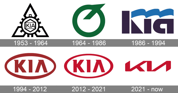
The badge, created for Kia in 1953, stayed with the South Korean automaker for almost a decade. It was an abstract geometric badge, with all the elements drawn in clean black Ines. The central part of the composition was taken by a hexagon, with the name of the brand in it, enclosed into a circle and surrounded by three sharp “petals”. The whole image looked like a train, moving straight at you.
1964 – 1986

The redesign of 1964 has introduced something completely new. It was an abstract and a very minimalistic logo, with a bold ring in moss-green, and a sharp element, looking like the numeral “1”, coming out of the ring’s top part to the center. There was nothing else on the badge, but it looked very progressive and solid.
1986 – 1994

In 1986 the Kia logo was redesigned again, with the name of the company as the main element. The lettering was set in a title case of an extra-bold sans-serif typeface, in dark blue, with the horizontally extended light blue wavy line, which replaces the upper bar of the “K” and covered the whole inscription. This made the logotype look like a fabric, with the steam coming out of the tall tube.
1994 – 2012
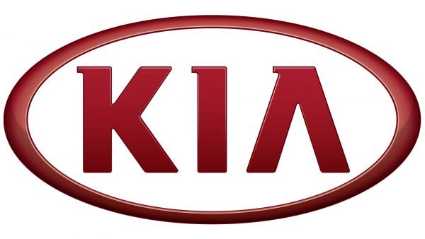
The design concept of the Kia visual identity was changed in 1994, with the color palette switched to red, and the composition — to simple lettering enclosed into a horizontally oriented oval. Both the logotype and the framing were set in one shade of red, dark and intense. The “Kia” inscription was set in the uppercase of a custom font with sharp and short serif coming out to the left from the top parts of the letters, and the “A” having its horizontal bar removed.
2012 – 2021
In 2012 the color palette of the Kian badge was enhanced, with the red getting lighter and brighter, at the same time the frame of the logo got more even, which made the band start looking better balanced and more elegant. As for the contours of the letters in the uppercase inscription, they remained completely the same as on the previous version of the badge.
2021 – now
The redesign of 2021 has changed the concept of the Kia logo, making it look futuristic and sleek. The new badge boasts stylized uppercase lettering with bold bars cut diagonally. The “I” and “A” (without a horizontal bar) form an N-like shape, touching the “K” in the upper point.
Symbol
The three-dimensional KIA Motors logo symbolizes intrinsic for the company youngness and energy. The flexible refined ellipse symbolizes the Earth and emphasizes the status of KIA as one of the leading players in the world automobile industry.
Color
The deep red KIA logo color is associated with solar heat and implies the constant focus of KIA ahead in its lively, optimistic style.
Emblem
The KIA international logo is laconic and simple in its form. Each line makes its significance and its sense, and this is not just the company name circled in the oval.
Today, products with the KIA emblem are sold in 170 countries of the world, and the total volume of the production exceeds 650 000 cars a year.
The updated concept car KIA with the name of Novo became the embodiment of the new style, the design of the South Korean company. The name Novo originates from the Latin word “novatus,” which means renewed. All the details and the car aspects are oriented towards its future owner. Constructors and developers of the KIA design center built in minimalism, laconism and at the same time innovative style, and the pioneer “contents” in this novelty.
KIA Motors strives to become the leader in the market of cars with a low emission by the year 2020. Precisely this plan must help the brand to enhance fuel efficiency and reduce the total emission in all the line of cars to 25% by the end of this decade.
Along with Niro, the first model, which appeals “for strategy 2020” to be realized, the car Optima will become an ecologically-friendly vehicle as well.
One more great and important direction of the KIA brand development is a complex of technologies for autonomous driving. The first semi-autonomous car must appear in the framework of the concept 2020, and by the year 2030, the company plans to represent a completely independent car capable of bringing passengers to the destination without any intervention of an individual.
By the year 2020, the KIA Company plans to become one of the leaders in what refers to up-to-date car technologies and provision to its buyers of premium products of the highest quality and standards.
KIA Soul logo
The small 5-door crossover was styled by Mike Torpey in the first half of 2005. However, it wasn’t until 2008 that the KIA Soul was unveiled. It is a front-engine, front-wheel-drive vehicle existing in its second generation. Those interested in eco-cars can buy an electric version called the Soul EV. The KIA Soul logo that can be seen on the recent models has a stylish, smooth lettering.
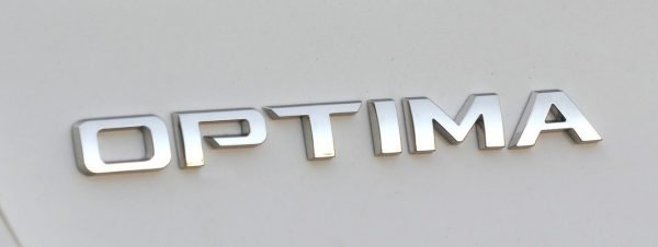
KIA Optima logo
The mid-size four-door sedan was sold in different countries under different names, including Optima, Magentis, Lotze, and K5. The new generation is marketed under the Optima nameplate globally with the only exception of China. The KIA Optima logo features a clear sans-serif font. In spite of a rather simple font, the badge looks stylish, with the recognizable “P” letter.
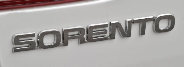
KIA Sorento logo
The KIA Sorento logo can be recognized by its characteristic “bridges” between the letters of the badge. Except for this, the shiny silver lettering looks standard. Today, Kia Sorento is a mid-size crossover SUV. However, the first generation of this range included only mid-size SUVs. The third generation, which was unveiled in the middle of 2014, has the same platform as the 2015 KIA Carnival.

