| Founded | 1966 |
| Headquarters | Mioveni, Argeș, Romania |
| Parent | Renault |
| Official Site | www.daciagroup.com |
| Official Facebook Page | www.facebook.com/Dacia |
Dacia is the largest and the most famous auto-manufacturing company in Romania, which was established in 1966. Today the brand is owned by the French Renault group and has its vehicles exported all over Europe and some of the counties on the African continent.
Meaning and History
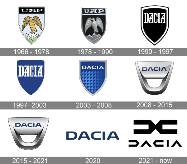
Today, Dacia logo is among the most iconic and recognizable ones. The logo has come a long and thorny path toward obtaining its present-day shape.
1966 – 1978
The very first Dacia logo was introduced in 1966 and stayed with the manufacturer for a decade. It was a colorful traditional crest, with the yellow bird sitting on the snow peak of a mountain, on a light blue background. The crest was outlined in black and had a wide black banner with white lettering on top. The letter comprises a smooth bold “UAP” abbreviation, which stood for the Uzina de Autoturisme Pitesti, the first name of the company.
1978 – 1990
The redesign of 1978 has introduced a three-dimensional version of the original Dacia badge. Now it was executed in solid black, with all the elements, including the bird, the mountain, and the lettering in voluminous silver metallic. This badge stayed untouched for another decade.
1990 – 1997
The company changed its name to Dacia in 1990, hence the logo was redefined in the same year. It was still a traditional crest in black, but with a sharp bottom part, a double black and white outline, and the bold white “Dacia” lettering in the uppercase of a fancy serif font, written over the top part of the crest.
1997 – 2003
The redesign of 1997 has switched the color palette of the Dacia visual identity from black-and-white to blue-and-white and removed the outline of the crest. Now the enlarged white logotype of the brand was written over the top part of a solid blue crest, looking airy, bright, and eye-catching.
2003 – 2008
The Dacia logo becomes more modern and complicated in 2003, with the crest getting a thick silver outline, and a triangular “carbon” pattern, with some blue gradients. The logotype is now set along the top border of the crest, set in all capitals of a bold custom font with sharp triangular serif on the ends of the diagonal bars.
2008 – 2015
Logo has a shape of an upturned silver-gray trapezoid with rounded bottom angles and featuring a plate, on which the brand name is written in the blue capital letters..
2015 – 2021
The redesign of 2015 has refined the colors on the Dacia logo, making it look cleaner and lighter. Although the badge is still set in silver gradients and blue shades of the letters, it became a bit colder and got some matte touch to its surface. This version of the logo stayed with the Romanian manufacturer for six years.
2020
In 2020 the automaking brand decided to go full minimalism and started using a simple black logotype as the only element of its visual identity. The lettering was set in the uppercase of a bold and modern sans-serif typeface, on a transparent background. Although the idea was cool, Dacia stopped using the badge in a few months, introducing the new logo in 2021.
2021 – now
The Dacia logo, created in 2021, is something completely different for the brand. Set in a black monochrome palette, the badge is composed of a graphical element, and a stylized logotype, set under it. The new emblem of the Romanian company is an abstract geometric figure, formed by two mirrored horizontally located elements, which are connected in the center. Both elements can be found in the inscription — the left one is the letter “D”, and the right one is the letter “C” in the new futuristic logotype.
Font
The sharp geometric lettering from the primary Dacia logo is executed in a custom typeface with extra-bold lines, and straight cuts of the letters. All characters are horizontally stretched, and have minimum details, with some of the bars being removed.
Color
For most of its history, Dacia has been using blue as the base color of the palette, but starting in 2020, the company switched to the black-and-white color scheme, which looks powerful and stable. The new color made the company look stronger, and its badge — was super edgy and stylish.


