Founded: 1897
Defunct: 1967
Founder: Edoardo Bianchi
Headquarters: Italy
Bianchi is the name of a historical motorcycle manufacturing brand, which was established in 1897, by the famous designer and engineer Eduardo Bianchi. In those days the history of motorcycles was in its beginning phase and Bianchi became an icon, and the head of the Italian motorcycle movement, producing the best motorcycles of those years.
Motorcycle History
The company began in 1895 when Eduardo Bianchi had his career focused on fixing bicycles. He decided to expand his business, as the service was in great demand. A year later, the inventor put pneumatic tires on the bicycle and then built a three-wheeled carriage with a De Dion engine. Unfortunately, the prototype exploded during tests, but Eduardo Bianchi’s persistence was rewarded with invaluable experience designing his machinery.
In 1901, Bianchi returned to the world of motorcycle manufacturing with new parts and a new engine. In 1905, the company mastered the production of cars and the brand itself was renamed Eduardo Bianchi & Co.
In the 1920s, Bianchi motorcycles began to take part in various competitions around the world. At that period the most famous model of the brand was a 500 CC bike, which managed to set the record of the maximum speed of 125 km/h.
Since 1920, Bianchi sales began to fall due to strong competition from other Italian and European companies, which had more affordable prices for their bikes and more interesting aesthetic and technical characteristics.
After the war, Bianchi concentrated mostly on on-road motorcycles. Until the 1950s, the company’s motorcycles did not participate in Grand Prix, although they won many other competitions. This was the period when Bianchi released several new models with 174b 248 CC and 250 CC engines (created by Italian engineer Lino Totti).
Unfortunately, during the next 10 years production of Bianchi motorcycles was constantly reducing. All this led to the cease of all the company’s operations. Today, the brand has turned into a small business that specializes in the production of bicycles.
Brand Logo
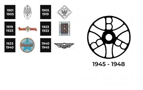
Unlike many other historical brands, Bianchi was very open to experiments in everything, including the visual identity design. This is why the number of logo refreshments is truly impressive.
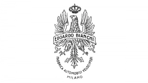
1901 – 1905
The very first Bianchi logo featured a heraldic composition with an eagle, a crown above its head, and an arched ribbon with the “Edoardo Bianchi” inscription in all capitals on it. Under the image, there was an additional “Fabrica Automobili Velocipedi Milano” lettering arched from the center.
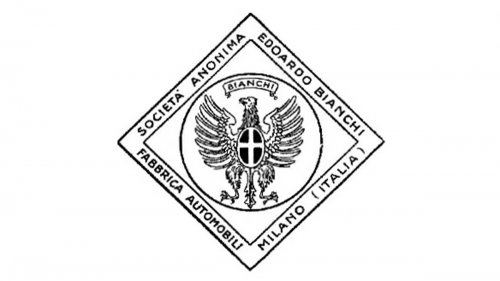
1905 – 1919
In 1905 the eagle was slightly redrawn and gained a circular outline. The image was now placed inside a rhombus with a double frame, where the full name of the company was written in black capitals. As for the name of the brand, Bianchi, it was now set above the eagle’s head, replacing the crown.
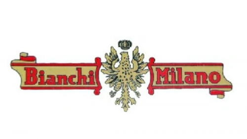
1919 – 1923
The eagle turned to gold and got its crown back in 1919. Now the image was set between two parts of gold and red banner with the red “Bianchi Milano” inscription on it. The lines and shape of the banner added a Royal and chic feeling to the whole composition.
1923 – 1933
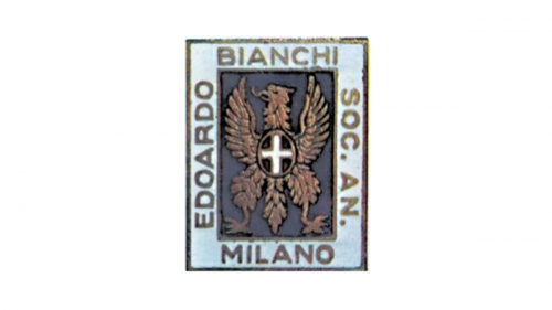
In 1923 the eagle got placed on a light blue rectangle, which was oriented vertically and had its central part colored in calm purple. The “Edoardo Bianchi Soc. An. Milano” inscription was set on a sky-blue background of the badge’s frame.
1933 – 1940
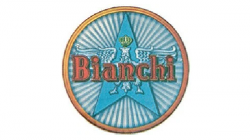
The shape of the logo turned a circle in 1933. The eagle was now set on a blue star, enclosed in a circular frame, with a red “Bianchi” wordmark placed over it. The new logo was different from all the previous versions, though looked fresh and bright.
1940 – 1945
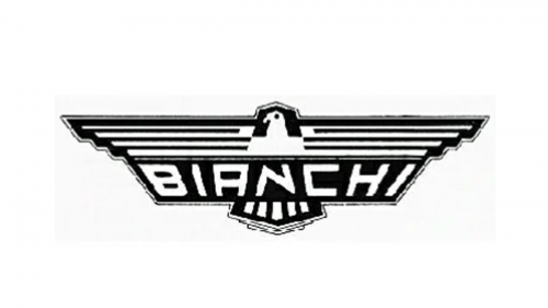
The Bianchi eagle from 1940 looked more like a Nazi symbol, with its straight wings spread to the sides and a monochrome color palette. The logotype was written on a black rectangle, placed on the bottom part of the eagle’s body.
1945 – 1948
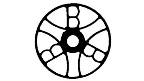
The redesign of 1945 simplified the Bianchi emblem to just a stylized wheel in a monochrome color palette. No additional details, and no lettering.
Emblem and Symbol
Since the first days of the brand’s history, its main visual symbol was an Eagle. Taken from the Bianchi family crest, it became a representation of grace and free spirit, brilliantly accenting into the essence of the brand and its iconic products.
Font and Color
The last time the Italian motorcycle manufacturer used wordmark in its logo was during World War II, and it was a bold geometric inscription in a custom sans-serif typeface. The letters looked solid and strong, representing stability and confidence.
Though the company changes the design and color palette of its logo pretty often, it is still finished with the monochrome scheme, which is a timeless and elegant combination, capable to elevate any style to heights.
The Legends
Freccia Celeste or Blue Arrow. The engine was 348 cc. The engine had excellent power and the bike was recognized for its power, reliability, and speed. This model participated in such races as the Monza Grand Prix and the Milan-Taranto race.
In the ’20s and 30’s the model became a winner in almost all competitions held. In the late 1930s, another model with a 492 cc engine appeared.


