| Founded | Nov 03, 1911 |
| Founder | Louis Chevrolet William C. Durant |
| Headquarters | Detroit, Michigan, United States |
| Slogan | “Find New Roads” |
| Owner | General Motors |
| Official Site | www.chevrolet.com |
| Official Facebook Page | www.facebook.com/chevrolet |
Chevrolet is one of the oldest and the most iconic American automaking companies, which was established by William C. Durant in 1911. Today the cars of the brand are sold on every continent and take leading positions by sale volume on the local market.
Meaning and History
The date of the 3d of November 1991 is generally accepted as the day of the Chevrolet company foundation.
Thus, the car racer Louie Chevrolet and William Durant founded a new company for motor vehicle manufacturing. Louie Chevrolet personally designed the first car of the make. The car was fitted with an engine of 30 hp and a simple three-step gearbox. This model Classic Six did not get traction due to its high cost.
Further, Durant staked on cheaper and simpler cars. The car Baby Grand with its four cylinders` engine and the sport car Royal Mail were produced. In 1914, Baby Grand got the worldwide known Chevrolet logo for the first time. These cars were rather popular.
Two years after the production of its first successful cars, Chevrolet created its masterpiece. Chevrolet-490 earned a great fame to the company. It was manufactured from 1916 to 1922.
In 1918, the Chevrolet Company bought the controlling block of shares of GM. Within the next 12 years, its cars had sales success.
In 1967, the third generation of Chevrolet Impala, which was produced during the next 10 years and still has popularity, rolled off the production line.
The iconic car Chevrolet Camaro SS was produced in 1967. In its starting completeness, this auto was just luxury. The engine per 6.7 liters was installed, which gave the increase in power up to 325 hp.
1911 – 1913

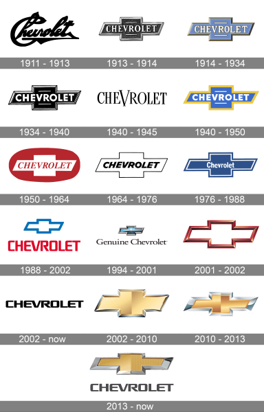
The very first Chevrolet logo, introduced in 1911, was completely different from all the following versions, and only stayed with the company for two years. It was a bold black script lettering with overlapping loops of the characters on top, and a massive triangular underline at the bottom.
1913 – 1914
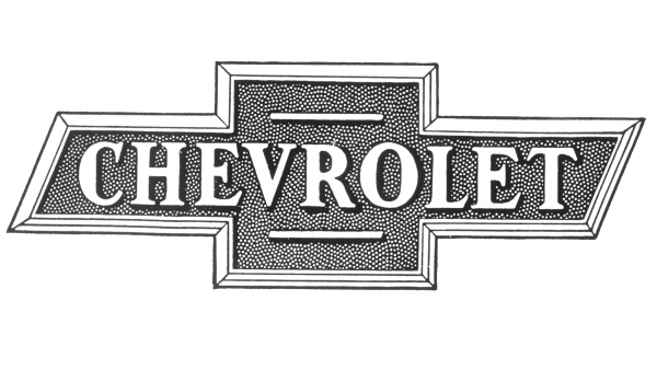
The first Chevy bowtie logo saw the light in 1913. It was a horizontally oriented wide cross in a silver outline, with the uppercase “Chevrolet” inscription across its horizontal bar. The lettering was set in a bold and confident serif typeface and was accompanied by two short straight lines above and under it.
1914 – 1934
In 1914 the bowtie badge got colors. Although the composition of the logo remained unchanged, all the contours got refined and with the sky-blue shade of the background, the whole insignia became sleek and delightful. The golden frame of the cross was complemented by the golden outline of white letters and two additional lines on the badge.
1934 – 1940
The redesign of 1934 kept the shape and composition of the Chevrolet logo untouched but switched its color palette to flat black and white, and rewritten the logotype in a bold and modern sans-serif typeface. The white horizontal lines became thinner, while the framing of the cross — wider, being now double, black and white.
1940 – 1945

For five years at the beginning of the 1940s, the American automaking brand has been using a simple inscription as its primary logo. It was uppercase lettering in an elegant and slightly condensed serif typeface, with the letter “V” enlarged. It was a symbol of the victory and success of the brand in the local market.
1940 – 1950
The iconic bowtie logo was also used in the 1940s by Chevrolet, bringing back the delightful blue and gold color palette from the badge of 1914. It was a flat, two-dimensional badge in a thick golden frame, with the bold white sans-serif lettering written over the intense blue background of the cross, and accompanied by two thin white horizontal lines.
1950 – 1964
The composition and color palette of the Chevrolet logo was significantly changed in 1950. The bowtie turned white and got placed on a horizontally oriented intense red oval, with the lettering in the same color. The new inscription was set in a slanted serif typeface over the white cross, looking classy and elegant. The horizontal striped were gone from the logo.
1964 – 1976
In 1964 the oval was gone, and the refined black-and-white bowtie got placed on a transparent background again. It was a white cross outlined in black, with the bold italicized inscription in smooth black letters. The logo looked simple yet confident and stable.
1976 – 1988
The new bowtie was introduced by Chevrolet in 1964, and the refined logo stayed as the company’s primary for the next decade. It was a calm blue cross in a double white and blue outline, with the small white lettering in the center. The logotype was set in the title case of a regular clean sans-serif font with bold letters placed pretty close to each other.
1988 – 2002
The concept of the Chevrolet visual identity was changed in 1988 again. The logotype was now set under the outlined cross, white was drawn in white, and framed in bold blue lines. As for the inscription part, it was executed in the uppercase of a custom sans-serif font with the slightly narrowed letters colored red.
1994 – 2001
The bowtie becomes three-dimensional in 1994. The new emblem was set in blue, white, and black gradients, with a voluminous silver frame. As for the wordmark, it was now composed of black “Genuine Chevrolet” lettering, written in the title case of a full-shaped serif typeface. Something completely different from all the previous versions, this badge only stayed with the brand for seven years.
2001 – 2002
For only one year at the beginning of the 2000s Chevrolet has been using a three-dimensional outlined bowed in gradient red, without any lettering. It was just a bright voluminous frame, set on a transparent background, without any additional elements. Minimalistic, modern, and sleek.
2002 – now

After the graphical insignia, the company introduced its text-based badge in 2002. The bold black logotype in a custom and recognizable corporate typeface is set on a transparent background, being the only element of the new badge. The two letters “E” in the inscription are connected to the characters on their right, while all the other letters are set separately.
2002 – 2010

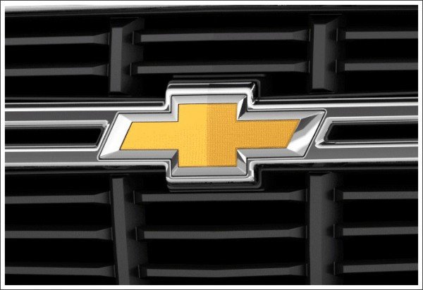
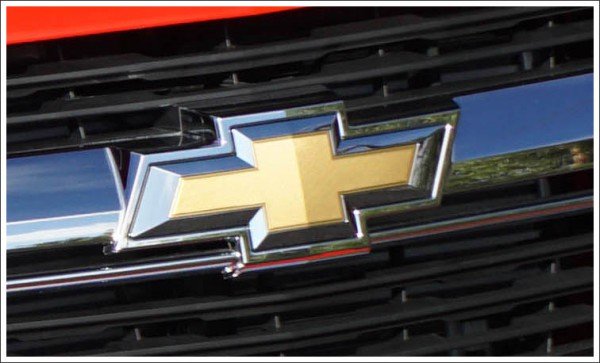
Another logo, created for the American brand in 2002, was a three-dimensional bowtie in glossy gold with a silver outline. The cross became bolder and taller, with its horizontal bar slightly shortened, which made it look more balanced and strong. The glossy gradients of the bowtie’s surface added a touch of elegance and luxury to the simple geometric contours of the badge.
2010 – 2013

The redesign of 2010 kept the gold and silver color palette of the bowtie, but refined its contours, enlarging the frame, making its lines cleaner, and the corners — sharper. The height of the vertical bar of the cross was reduced again, while the horizontal bar got stretched, returning the emblem to its original contours.
2013 – now
The gold and silver bowtie got a vertically-striped pattern of its background and is now accompanied by a medium-gray logotype in the corporate Chevrolet typeface, placed under it. The smooth lines of the letters balance the sharp straight contours of the cross, making the whole composition look harmonious and stylish.
Description
The Chevrolet logo is a unique shining cross in traditional metallic tints. Mr. Durant first showed it in 1913.
While some credit Mr. Louis as its sole author, who incorporated the Swiss cross in his design, the others admit that it was actually Durant who created the Chevrolet symbol, taking inspiration from a lovely wallpaper, which he had seen in a hotel in France.
Sometimes referred to as the “Chevy bowtie,” the bow is orthogonally placed over the company’s name. The Chevrolet logo is known worldwide for its unrivaled creativity, simplicity, and clarity.
Font
The iconic Chevrolet logotype in its current typeface was first introduced in 2002. Its’ smooth and sleek capital letters, written in bold clean lines, are executed in a custom typeface, which has no commercial analogs. Although, the softened and rounded contours of the Chevrolet inscription are based on the shapes of the letters, resembling Avionic Wide Heavy font.
Color
The color palette of the Chevrolet visual identity is based on gold and silver gradients, with a flat gray shade for the lettering. It is a luxurious and fancy combination, pointing to the quality of the vehicles and the confidence of the company. The glossy metallic bang looks elegant and timeless, evoking a sense of excellence and professionalism.
Symbol
The Chevrolet symbol is undoubtedly one of the most popular, memorable and instantly recognizable logos in the automobile history.
In all the history of its existence, this make manufactured various cars. Both ups and downs of the make took place, there were interesting and unsuccessful solutions and names of cars, but in any case – the make Chevrolet is really considered one of the best in the world of car manufacturers.
Emblem
The Chevrolet emblem has yellow, gold, silver and black tints. All these colors mean the company’s rich heritage, ingenuity, grace, and passion. The Chevrolet emblem has a custom typeface.
The make Chevrolet does not lose positions in the market. Moreover, it expands to a vast number of countries and their markets and occupies precisely those niches, towards which the constructors and the engineers were oriented during the creation of cars. Inexpensive autos for a middle class, courtesy cars for governments, and even the rare rarity cars of the make Chevrolet have great popularity today as well.

