| Founded | 1926 |
| Founder | Karl Benz Gottlieb Daimler |
| Headquarters | Stuttgart, Germany |
| Divisions | Mercedes-AMG Mercedes-Maybach |
| Slogan | “The Best or Nothing” |
| Owner | Daimler AG |
| Official Site | www.mercedes-benz.com |
| Official Facebook Page | www.facebook.com/MercedesBenz |
Meaning and History
In 1926, two carmakers Daimler-Motored-Gesellschaft (DMG), founded by Gottlieb Daimler, and the Benz & Cie firm founded by Carl Benz, merged together and formed a new company under the name of Mercedes-Benz.
There is a curious fact: two car plants were in the distance, not more than 100 km from each other, although they had not known about the existence of each other before. After the Second World War, the companies formed the syndicate, where each one produced cars under its own brand, but the procurements and advertising were executed jointly. Thus, the consortium “Daimler-Benz” was born.
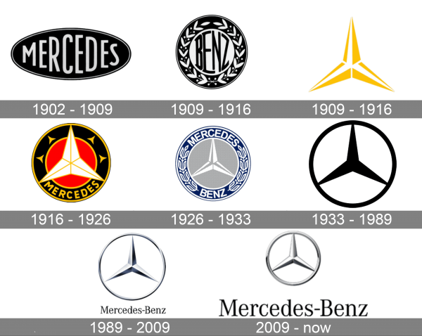
The three-pointed star introduced in 1909 was not the first version of the Mercedes-Benz logo. Seven years earlier, in 1902, the company used another emblem – the word “Mercedes” surrounded by an ellipse.
Originally Daimler-Motoren-Gesellschaft trademarked not only a three-pointed star logo but also a four-pointed star. However, the latter was never actually used on the company’s cars.
The sonorousness particle “Mercedes” joined the name in 1900, when the prosperous European businessman Emil Jellinek bought up the Daimler Company and started to create more perfect cars with modernized engines. In honor of his ten-year-old daughter named Mercedes, the loving father Emil named his company. The full name sounded as Emil Jellinek-Mercedes (afterward, it became Mercedes- Benz).
On the 26th of March, 1901, the three-ray star was officially patented as the firm sign of the Mercedes Company. The company logo in the form of a star has its history, which was expanding very harmlessly and not as tensely as the company name. Thus, for example, the three-ray star Mercedes is widely known as a symbol of the fact that the motors being manufactured by this company are used on the ground, in the sky, and on the water. But the star premiered in the letter of the founder of Mercedes, Gottlieb Daimler, to his wife.
With this star he marked the place of the location of the new house of his family in German city Doitts with the caption “someday this star will loom above the roof of my car factory, symbolizing prosperity.” His sons adapted the symbol under the company logo in 1910. Another version is that it signifies three people who gave life to Mercedes: Wilhelm, Emil Jellinek, and Mercedes Jellinek.
1902 – 1909
The logo of the Mercedes brand was simple and at the same time sophisticated and luxurious. It was a black oval emblem with “Mercedes” printed across and filling the shape. The designer chose a basic, sans-serif font of white color. To add a touch of elegance, they added a thin white border line that was indented inwards to stand out. The resulting emblem looked professional and timeless.
1909 – 1916
The logo of the Benz brand was also done in the black and white color palette but had a round form. Interestingly, it also chose to have the characters fill the round center portion of the emblem. For the border, the company chose to have a wreath, a sign of victory and success.
1909 – 1916
A three-pointed star, which will later become a key element of the Mercedes-Benz brand was created in 1909. It was done in a yellow-and-white color palette. One of its ends pointed up and the star itself was drawn to have a three-dimensional appearance. It was a simple emblem that became associated with a great brand.
1916 – 1926
The star emblem was elevated by adding a round background. The color choices were bold, consisting of yellow, red, and black. It gave the logo a powerful and attention-grabbing appearance. The red center behind a white star with a yellow outline looked like a sun with yellow sun rays coming out on the sides. The word “Mercedes” was printed at the bottom using a yellow color ad a traditional, sans-serif typeface. The brand surely tried to position itself as the best.
1926 – 1933
This is the first logo that combined the name of two companies that created one of the most recognizable automobile brands. They are printed across the top and the bottom of the border. The logo also features a wreath around the border, which was inspired by the 1909 logo of the Benz company. A star is also included in the logo. For the color palette, the designers went for dark blue, white, and light gray. These colors symbolize strength, reliability, trustworthiness, and perfection.
1933 – 1989
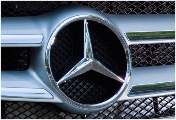
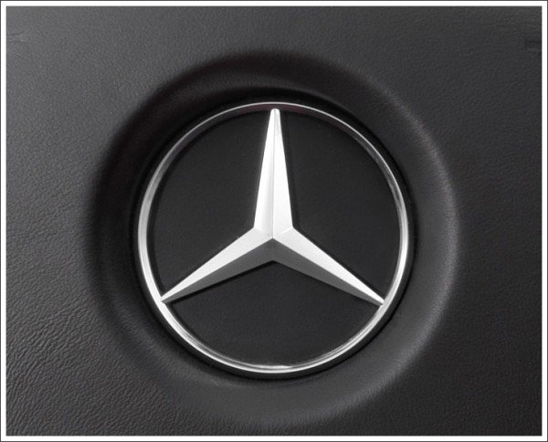
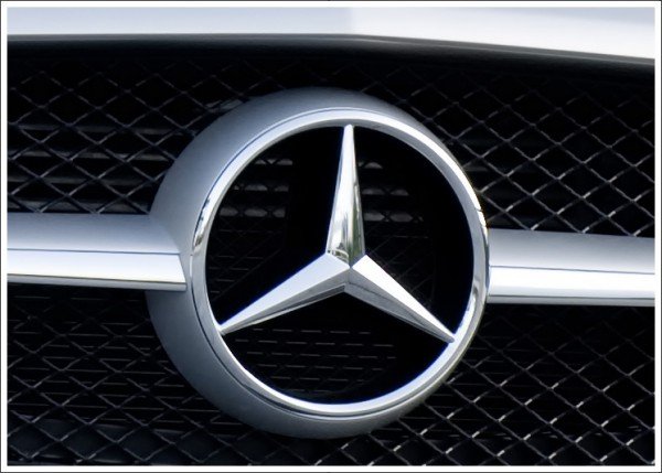
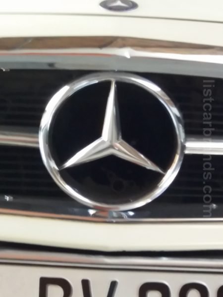
This logo does not look like it was designed a century ago. Its timeless look is achieved by creating a very minimalistic look with the flat image of an iconic three-pointed star and a ring around it. The black and white color palette also contributed to the stylish, timeless, and sophisticated look of the emblem. for some, the emblem looks like a steering wheel, which is a perfect association for an automobile manufacturing company.
1989 – 2009
A light metallic silver color, which is closely related to technologies and the material the automobiles are made of, replaced the more formal and classic black. The logo acquired a three-dimensional look. The sharp ends and angular shape of the star gave an impression of a company that stays on top of all the modern trends and technological advancements. “Mercedes-Benz” was printed under the round emblem in a black, serif font that resembled Corporate A Condensed Regular. The inscription was the same width as the round emblem, which created a well-balanced look.
2009 – now
The updated logo has a much warmer silver color for the round emblem. The latter features a more angular shape for the ring, while the star has smoother lines. These changes created a more welcoming appearance and reflected the stylish look of the Mercedes-Benz automobiles. This round emblem, though, was no longer the center point as the name of the brand was significantly enlarged without having any other changes done to the inscription.
Symbol Description
The Mercedes symbol, the three-radial star, originally in a laurel wreath or in a circle, became the symbol of the two companies merging.
There is one more history, which is attributed to the three-beam star appearance. It is told that a figure of a woman with wide-set feet and hands raised high above the head is inserted into the circle. This insignia echoes of ancient times, when women’s heads or woman figures were carved in the snouts of ships. This symbol was considered a protective amulet of a ship. Thus, on Mercedes, the goddess protects a car in a cruel asphalt jungle.
Color
The colors that one can see in the Mercedes logo are black and silver. The silver color features sophistication, creativity, and excellence. The black one stands for elegance, integrity, and purity.
Emblem
The Mercedes-Benz emblem represents the Corporate ASE type of letters. The Mercedes brand takes the 11th place in the world. This car make is the costliest in Germany. Specially or inadvertently, the creators of the Mercedes emblem filled it with the certain sense which was enshrined forever. The associations which this car causes are constant: quality, conservatism, reliability, prestige, and safety.
In 2007, the concern was renamed Daimler AG. At present, the Mercedes Company is a unit of the Daimler AG concern. The company headquarters are in German Stuttgart.
Also, Mercedes’s engineers have already created a model F 015 with independent control. This is a car of future.


