| Native name | 日産自動車株式会社 |
| Founded | Dec 26, 1933 |
| Founder | Masujiro Hashimoto |
| Headquarters | Nishi-ku, Yokohama, Japan |
| Slogan | “Innovation that excites” |
| Divisions | Infiniti Datsun |
| Owner | Renault |
| Official Site | www.nissan-global.com |
| Official Facebook Page | www.facebook.com/NissanMotor |
Nissan is a Japanese car manufacturer, which was established in 1993. Today the company successfully operates across the globe, producing not only passengers and SUVs under its main brand, but also luxury Infinity vehicles, and budget cars under the Datsun marque.
Meaning and History
Nissan is the fifth biggest automobile manufacturer in the world. It is one of the leading car manufacturers in the world as well. Having plants in 20 countries on all five continents, the company sells three million cars every year almost in 170 countries.
Everything began in 1914 with the production of a car DAT, 20 years before the company was called Nissan. The name DAT was got from the initial letters of names of three founders of the company, all together they meant “prompt, vivid” in Japanese. Then this name was transformed into Datsun (the son of DAT).
In 1950, Nissan started development and motor vehicle manufacturing for the foreign markets. This business developed rapidly: in 1960, Nissan Motor Corporation was created in the USA, in 1966, the first car factory Nissan outside Japan started its work in Mexico, and in 1980, plants in Europe and the US were opened. However, for sales in West, the name of “Datsun” was used until the end of 1982, when it was replaced by Nissan.
Nissan was established in 1933 by concerted efforts of two companies – “Nihon Sanyo” and “Tobata Casting,” which planned to manufacture and sell the cars “Datsun.” Originally the company was called “Jidosha Seizo Co., Ltd” and was renamed in Nissan in June 1934 (“Ni” from “Nihon” – Japan, “ssan” from “sangio,” which means industry).
1933 – 1940
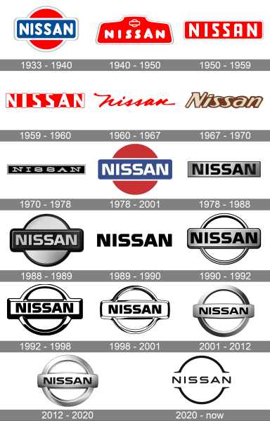
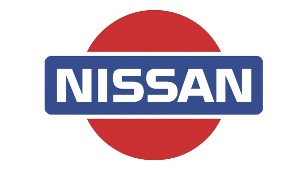
Then, the logo was mentioned. Thus, the red circle became the first distinguishing sign of the brand; it was with the blue rectangle inside the company’s name in the middle. These colors (red and blue) embodied the sun and the sky. The Japanese do not betray their style and remain enigmatic and mysterious, but the emblem turned out fairly simple. The Nissan logo is a symbol of the rising sun.
1940 – 1950
The redesign of 1940 introduced a solid see badge with delicate white details. The roundel, crossed by the rectangular banner was now contoured in white and placed in the upper part of the logo, above a massive white uppercase logotype, executed in an extra-bold rounded sans-serif typeface. A medium-thick white frame of the badge was balancing the heavy letters of the wordmark.
1950 – 1959
In 1950 the Nissan logo got significantly simplified. Now it was a horizontally oriented solid red rectangle in a white outline with a bold uppercase “Nissan” lettering in a custom geometric sans-serif font with most of the edges rounded. The logotype was drawn in white.
1959 – 1960
The white letters of the logotype got refined and cleaned, gaining straight geometric shapes. The lettering was now larger than the red rectangle, and with the white frame removed, the edgy white characters were coming out of the banner both on the top and bottom lines. This badge was only active for a few months.
1960 – 1967
With the redesign of 1960, the Nissan logo was dramatically changed. Even though the red and white color palette remained untouched, the style of the badge was completely different. The new logo featured a bright red inscription in a title case of a custom cursive font, which was placed on a plain white background without any framing or graphical additions.
1967 – 1970
Another experiment on visual identity was held by Nissan in 1968. The badge, created in that year was executed in a beige and brown color palette, with the bold title case logotype set in an italicized sans-serif typeface over a horizontal banner, which was narrower, than the inscription. The beige letters had the same chocolate outline, as the color of the banner.
1970 – 1978
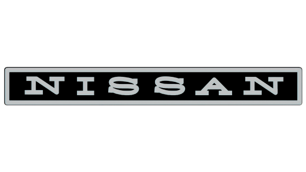
The logo from 1970 was executed in a black and silver color palette, with the bold uppercase logotype set in silver letters across the narrow rectangular banner in black, with a thick silver frame. The inscription was set in a rounded serif typeface, resembling a traditional typewriter-style font, but with the shapes of the characters slightly modified, and the serifs elongated.
1978 – 2001
The iconic red and blue logo, designed in 1933, came back as the Nissan primary badge in 1978 but got all the contours refined and modernized. The colors on the badge became calmer and deeper, and the lettering got a new custom typeface, with white bold capitals featuring smooth lines and straight cuts. The white outline of the red circle was removed.
1978 – 1988
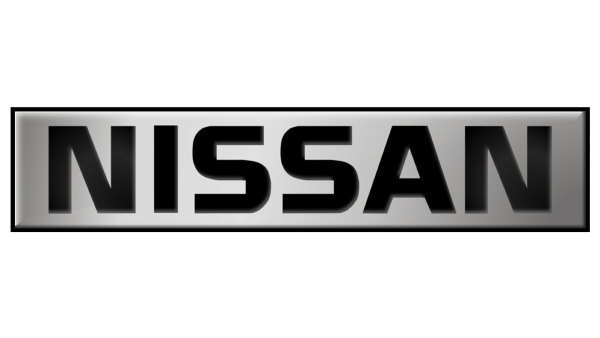
Another badge from 1978 used the same typeface as the previously described logo. But here the lettering was set in black and placed on a gradient silver horizontally-oriented rectangle with clean straight contours. This badge was used by the Japanese automaker for ten years.
1988 – 1989
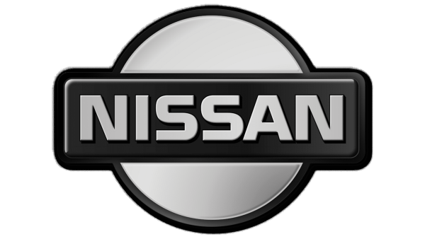
The iconic circle with a rectangle was reinvented in 1988, being executed three-dimensionally, in the silver and black color palette. The lettering was set in gradient metallic over a black rectangle with rounded corners, which was crossing a silver roundel in a delicate black outline.
1989 – 1990
For just one year, at the end of the 1980s, the company has been using a very simple logo — a black uppercase lettering over a transparent background. The inscription was set in the corporate typeface, designed for Nissan in 1978, this laconic badge looked very powerful and confident, despite the lack of details.
1990 – 1992
The circle with a rectangle came back in 1990 but in a new execution. It was now only a contoured silver ring, drawn in a thin voluminous line, crossed by a massive softened rectangle in the same color scheme, with the bold uppercase logotype in black. The company has still been using its corporate font from the 1970s, but the letters in this logo got a bit taller.
1992 – 1998
In 1992 the Nissan logo was redrawn in a black and white color palette, with no silver present. The composition was still the same, but the black outlines and shadows of the elements became bold and massive, to accent the white banner and roundel more. The letters of the wordmark got shorter again.
1998 – 2001
The number of black accents on the Nissan logo was reduced with the redesign of 1998. The new badge looked more elegant and sleek, even though, it had the same composition and typeface as many previous versions. The letters in the inscription got smaller, leaving more negative space on the horizontal banner, and this made the whole image brighter and chicer.
2001 – 2012
In 2001 Nissan decides to go back to three-dimensional logo design and redraw its badge in matte silver with smooth gradients. The lines of the uppercase letters, written on a rectangular banner, got thinner and more elegant, they also got a bit more space between them, which only elevated that feeling of chic and luxury.
2012 – 2020
The redesign of 2012 made the Nissan badge more voluminous by emboldening the lines of the ring and the rectangular banner and adding lighter gradients in warmer shades. The style and size of the logotype remained unchanged, but the wordmark started looking a bit different.
2020 – now
In 2020 Nissan introduced a new version of the logo, executed in a sleek minimalistic style. The new concept features a medium-wright black logotype in the corporate Nissan style but is written in thinner lines, with more space between the characters than ever. The lettering was accompanied by two arched lines above and beyond it. Each of the arches has its tails elongated and bent to the sides, creating an illusion of an invisible horizontal rectangle.
Symbol
The modern Nissan symbol appeared in 2001. On the symbol: the circle denotes the rising sun and the sincerity, while the rectangle features the sky. In general, as the company asserts, the sign expresses the motto: “Sincerity brings success.”
New logo Nissan 2020
Color
In favor of the brand the Japanese company refused traditional colors and registered its logo in a spirit of modernity. Now chrome color is present on the logo. The chrome-colored motive of the Nissan logo signifies sophistication, modernism, creativity, and excellence of the brand’s products.
Font
The bold uppercase inscription from the primary Nissan logo is executed in a modern sans-serif typeface with extended stable letters. The closest font to the one, used by Nissan for its badge is, probably, Stereo Gothic 700, or Ateros Regular, but with some contour modifications.
Emblem
Today, Nissan Emblem belongs to the second biggest Japanese carmaker and one of the leaders in the world car production, having a lot of units and subsidiaries besides its Japanese plants all over the world: in the US, in Europe, Australia, South America, Asia – in 17 countries in total.
The Nissan Company does not cease to surprise the admirers and the competitors and fairly frequently actively updates its news. Just recently the company has introduced a new hatchback model under the name Tiida. Actually, the novelty from the С class represents a modification of the sedan Nissan Sentra with five doors. The design of the hatchback Tiida is almost not distinguished from European Pulsar.
In addition, Nissan showed a prototype of compact hatchback future under the name of Sway. The Japanese manufacturer says, its design is specially created for the satisfaction of European tastes. The car is painted in bluish-dark-gray color and is borrowing style solutions from Juke and Qashqai, but has more radical forms suitable for the concept.
Moreover, the company plans to produce ecologically clean cars by 2020 and reduce the level of harmful emissions to the environment in cars across the brand’s line. It will allow, inter alia, to reduce medium fuel consumption by approximately 19%.
Also, in the nearest future, according to some data, it is planned to update the electric car Leaf and to launch an electric version of the compact van NV200.
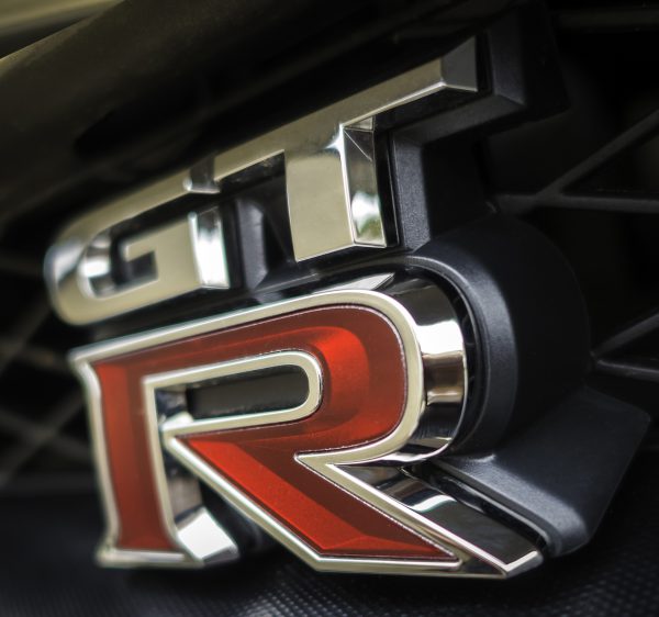
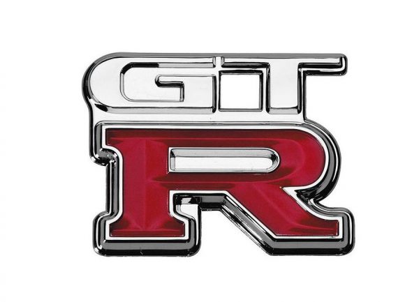
Nissan GTR logo
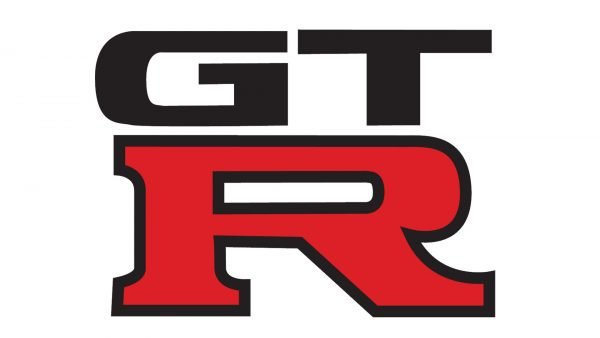
If you examine the Nissan GTR logo, you will certainly notice that it in no way resembles the car’s manufacturer badge. This is an absolutely independent symbol, created especially for this handbuilt 2-door 2+2 high-performance vehicle. The “G” and “T” letters on the top are silver, while the larger “R” letter, which is located under them is red.
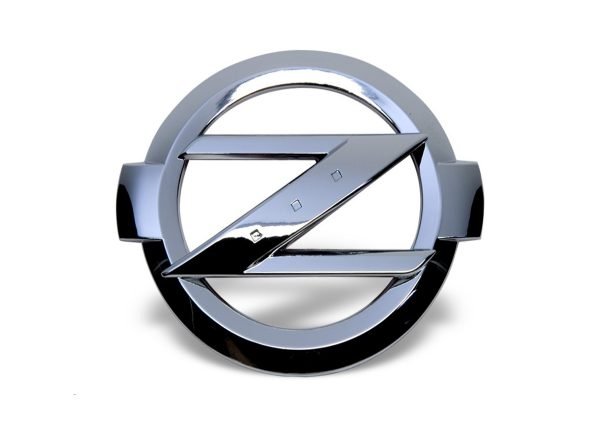
Nissan Z logo
The minimalistic, yet aggressive and recognizable, the Nissan Z logo suits the car perfectly. The Z range includes sports cars known for much better performance than other vehicles produced by the Japanese car manufacturer. The first Nissan Z was launched back in 1969. Forty years later, in 2009, the company created a completely new version called the Nissan 370Z.
Nissan Skyline logo
The Nissan Skyline logo consists of the word “Skyline” in a custom sans-serif font. It uses only capital letters. Interestingly enough, the Skyline sedan launched in 2014 has the Infinity emblem at front grille. It is absolutely reasonable, taking into consideration that the 2014 Skyline sedan actually uses the design of the Infiniti Q50 sedan.

