| Founded | 1901 |
| Founder | Emil Rathenau |
| Headquarters | Berlin, Germany |
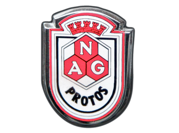
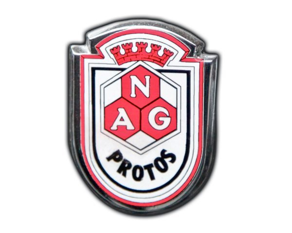
The NAG car manufacturer’s logo was created for the company Neue Automobil-Gesellschaft AG, later renamed the National Automobile Society of Germany.
The enterprise was engaged in the production of both passenger cars and commercial vehicles, and in Germany at the beginning of the twentieth century was among the top five in terms of production.
Initially, the logo was presented in a monochrome version (black and white), but subsequently used more often three-color (black, red and white) version of the logo. Black and red colors in the logo unambiguously refer to the flag of Germany.
Built on the principles of heraldry, even the base of the logo was taken from ancient coats of arms. By the way, the coats of arms with a semicircular base are often called “German”. The main element of the logo, contrary to the heraldic habit, was an unrecognizable decorative element or figure, and a complex design resembling a honeycomb of red color. The design abbreviated NAG. Also indicative is the upper part of the logo, where the heraldic pommel-crown was placed in the form of a wall with five towers. The symbolism of this pommel is obvious – the logo suggests that the brand has additional protection, and at the same time emphasizes quality (“royal”) and a focus on the future.


