
![]()
| Founded | 1937 |
| Founder | Edsel Ford |
| Headquarters | Dearborn, Michigan, United States |
| Parent | Ford Motor Company |
| Slogan | “New Doors Opened” |
| Official Site | www.mercuryvehicles.com |
Mercury is a name that stands for the brand of American cars, part of the company Ford. Production was neglected for the sale of middle-class cars between the models “Ford” and “Lincoln”. Since January 2011, cars of this brand are not produced.
Meaning and History
![]()
Like many other companies, the emblem of “Mercury” has changed over the years. This name was invented by Edsel Ford, who is the son of the founder of Ford Motors Company – Henry Ford. The name was given in honor of the ancient Greek god of trade. He possessed dexterity, cunning, and speed.
If you recall the mythology of ancient Greece, it was him who had sandals with wings on them. Of course, the emblem of the first car depicted the god Mercury; he was also a symbol of the brand. Choosing the name of the brand, the manufacturer made bets on high trade. For a long time, the brand was known for its performance, which could only be revived in 2003, but for a short time.
![]()
Replacement occurred only in the late 60-ies. The ancient Greek god in the circle was replaced with an image of the cat’s head with an open mouth that denotes enthusiasm and vitality. At that time, the same symbol was used in the advertising of “Mensury Coher” muscle of the 1967 car produced. After more than 20 years, the emblem changed its appearance dramatically.
Mercury cars were sold in the markets of the USA, Canada, Mexico and the Middle East. The first model of this brand was released in 1939 and was called “MERCURY8”. The production process lasted until 1942. Also during the Second World War, the company began to produce ambulances and light buses.
“Mercury” produced cargo, compact cars, as well as convertibles. In 2000, the brand became a subsidiary of the Lincoln Company. Since 2003, the Mercury brand has announced the gradual liquidation and transfer of employees to Lincoln.
1938 – 1984
![]()
The first logo of the brand looks contemporary even now thanks to its minimalistic design and black-and-white color palette. The logo features only the brand name printed in bold, italicized letters. The font has smooth curves that are magnificently combined with straight cuts. The unique feature of this font and logo is the white vertical lines that run through some of the letters. It added a daring touch creating an image of a company that stayed ahead of technological advancements. The fact that the logo was used by the company for so many years proves its timeless look.
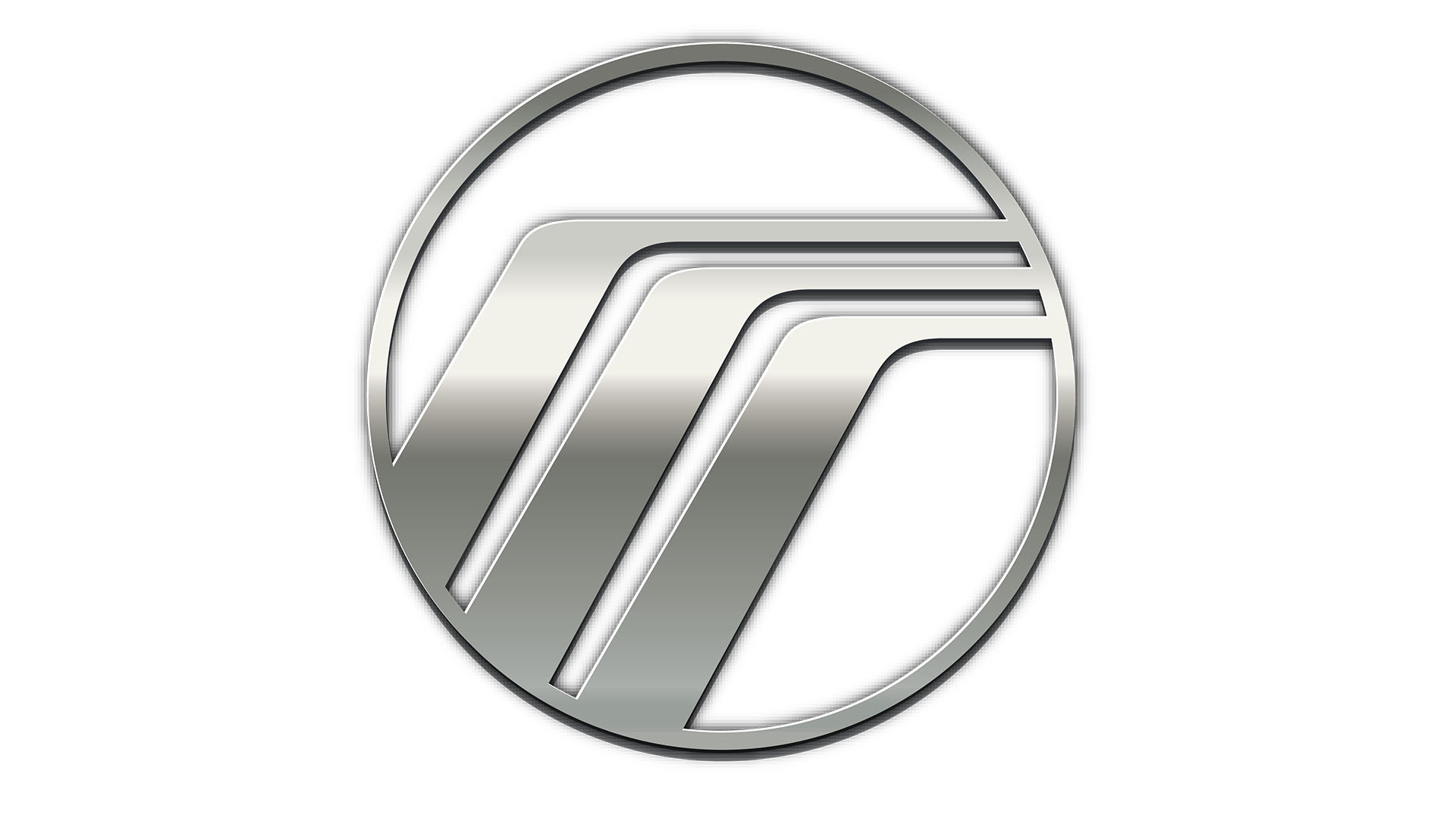
1984 – 2003
![]()
In the mid-1980s, the logo was replaced with a logo that looked like three curved lines of silver color, located in a full circle with a black background. It is the three lines that are stylized with the letter “M,” which indicates the name of the brand. It is worth noting that originally depicted graphic elements with an abstract image, which conducted an association with the brand, i.e., emblems, and then began to use the stylized alphabetic name – the logo.
2003 – 2011
![]()
This logo brings a completely new spin to the brand image with a shiny black and golden color palette. Thanks to the color choices, the emblem turned out very stylish and luxurious. It has a round form with three golden lines that curve and go into the horizon. The border also has a golden touch while the light accent gives an illusion that the emblem is not flat.
Font
![]()
The font on the last logo was the “Karmina Sans SemiBold.”