
![]()
| Founded | 1989 |
| Founder | Bill Bruce |
| Headquarters | Hopewell Centre, Wan Chai, Hong Kong |
| Parent | Nissan |
| Official Site | www.infiniti.com |
| Official Facebook Page | www.facebook.com/infiniti |
Meaning and History
![]()
The name of the Infiniti car brand was formed from the English “Infinity” which is something timeless and eternal. Initially, the brand’s name was spelled exactly the same, Infinity, but when the designers started working on the marque’s logo, it was decided to replace the last letter with the “I”.
In order to create a brand, which would be able to compete with the well-known manufacturers of luxury cars, Nissan decided to organize a tender among the leading advertising agencies, which had to develop not only a logo but had to invent the name of the new brand. There were several requirements: first, the name had to be short; second, the name had to be easily pronounced; third, the name must not remind of anything from the field of art.
As a result, the choice fell on the offer of the Lippincott Mercer firm serving such grandees as Coca-Cola, Samsung, Chevron, and IBM. First, the designers wanted to use a symbol of infinity – a Mobius strip – in the logo. But then, they decided to depict a road going to infinity in the logo, a symbol hinting at a perpetual way to perfection in everything.
Infiniti is a daughter firm of the Nissan Company, and its story is rather interesting. Everything began in the sixtieth years of the 20th century. At this time, Nissan came out to the US market. The Americans scented advantage and began to buy up the company’s inexpensive and reliable cars. Soon Nissan established itself as an economy car manufacturer, in this connection, it was inexpedient to represent cars of a higher level under the same brand in the market. Therefore, in the 1980s, the Japanese giant decided to create a separate brand, Infiniti.
Today, representational offices of the marque are located all over the world. With Infiniti new models are being introduced to the international market quite often. The company works on adopting the latest technologies to its models and never forgets about the design, which is super recognizable and sophisticated.
1989 – 2004
![]()
The Infiniti brand created a successful logo from the very start. The logo featured an oval shape with an inverted “V” cutting in at the bottom. It looked like a road going into the horizon, which is a way for the brand to tell that its vehicles open up endless possibilities for its owners. The simple, sans-serif font featured straight strokes and cuts and looked similar to Belle Sans Ex Cond Md by James Lyles. However, it had one unique feature – a very large spacing between the letters. This gave the logo not only an exclusive look but also created an image of a powerful brand with a strong standing. The whole emblem was done in a classic black-and-white color palette.
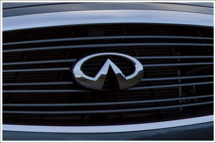
2004 – 2023
![]()
The company added a metallic silver color to the emblem, which symbolizes modern technology, strength, stability, and timelessness. This color was used for the oval emblem, which now had a three-dimensional shape. The name featured the same font, only the letters were made larger, bolder, and had less spacing between them. This update placed more accent on the brand name instead of making both elements equally important.
2023 – now
![]()
This logo is a blend of the two previous versions. The color palette returned to a classy yet formal black, and the oval emblem was made flat again. The name, though, was rewritten in large and bold characters, repeating the style of the previous version, but with more spacing between the letters to draw a connection to the original emblem. This logo looks very balanced and is a perfect update to the original Infiniti badge. An attentive eye will see that the font has also been modified slightly. Mainly, the lower horizontal bar of the “F” got a bit shorter while the other horizontal lines were slightly elongated.
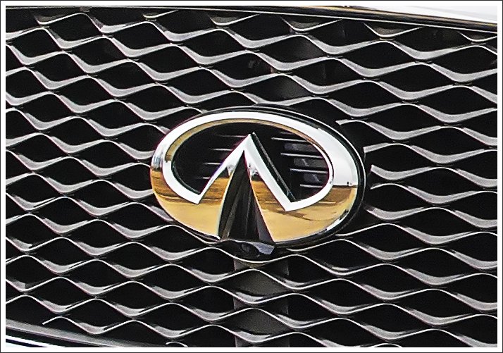
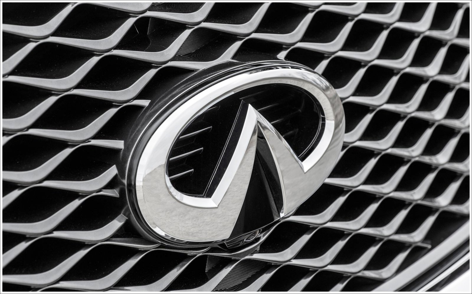
Symbol
The Infiniti symbol is an oval with a vertex of a triangle inside.
The Americans took the word “infinity” as the basis of the symbol. But one of the employees of the agency convinced everyone, that with four letters “I” it would look much more dynamic. In turn, in the base of the logo, the Japanese see a symbol of the mountain Fuji, but actually, this emblem means a road going far to infinity, hinting at the boundless possibilities of the prestigious brand.
Color
![]()
The color palette, used by the luxury Japanese car brand Infiniti, is based on a chic and timeless black-on-white palette, which just can not look bad, but with the perfect through your shapes and lines of the Infiniti badge, it works even better, adding class and elegance to the badge.
Emblem
The Infiniti brand keeps the memory of its origin. The rounded shape and the style of the brand’s logo make the Infiniti emblem look related to the iconic Nissan badge. Even though, the simplicity of the lines and minimum of the elements only enhance the luxury subtext, working great as a representation of the brand and its philosophy.