| Founded | 1904 |
| Founder | August Horch |
| Headquarters | Zwickau, Saxony, Germany |
| Fate | Merged with DKW, Wanderer and Audi to form Auto Union |
| Defunct | 1932 |
Horch is the name of a historical car brand, which was established by August Horch at the end of the 19th century, and was engaged in the production of luxury vehicles until 1959. Since 1932 the brand was the part of the German Auto Union.
Meaning and History
The brand was created in 1904 by August Horh, an entrepreneur from Zwickau (Saxony). Subsequently, in 1932, the brand became one of the components of Auto Union – this logo was one of four, contained in Audi rings in the first version of the new logo.
It is interesting that Horch from German translates as the call “Listen!”. Similarly, but the Latin name for “Audi” is also translated from Latin.
The Horch logo was formed from the foundation – the capital letter of the surname of its creator – and the classic heraldic top, “crown”. As a pommel in the light version of the logo, the name of the brand was used, in a sophisticated, ceremonial-decorative variant – in addition, either a crown or 7 stars were placed above the font.
The logo was presented in a monochrome black and white decision, which is typical for most logos of the early twentieth century. And in order to make the visual image more light and decorative, even in the most minimalistic reading, each element was geometric, which allowed to give even a planar design volume.
1899 – 1932
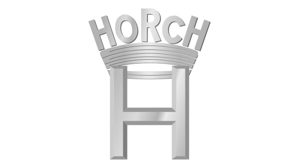
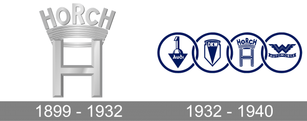
The very first Horch logo was introduced in 1899 and stayed unchanged until the formation of the Auto Union in 1932. That was a very simple yet fancy emblem, which reflected the “luxury” specialization of the company. The Horch logo was composed of the uppercase letter “H”, with a smooth and bold crown on top. The peaks of the crown were replaced by the letters of the “Horch” wordmark. The logotype was set in all capitals but had “O” and “C” slightly smaller than other letters.
1932 – 1940
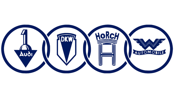
With the foundation of Auto Union in 1932, the new logo for the company was set. It consisted of four solid blue rings with an emblem of each of the four companies every one of them. The first ring was taken by the Audi badge, the second — by the DKW, Horch had the third ring, while the fourth was for the Wandler brand. On the new logo, the Horch “H” and the crown were drawn in thin blue and white lines.

