| Founded | 1856 |
| Founder | James Alexander Holden (original firm) Edward Holden (automobile division) |
| Headquarters | Port Melbourne, Victoria, Australia |
| Parent | General Motors |
| Slogan | “Let’s Go There” |
| Official Site | www.holden.com.au |
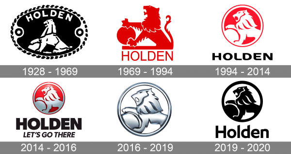
While the Holden logo has been updated more than five times, it has always been based on one and the same symbol – a lion holding a stone.
Meaning and History
1928 – 1969
The lion holding a stone could be seen on the earliest Holden logo introduced in 1928. Back then, the design was pretty raw. In comparison with the current lion, its predecessor lacked elegance, grace, and attractive proportions. However, the creature’s noble character was represented pretty well by its upright posture. Above the lion, the lettering “Holden” in a sans serif all-cap type could be seen. The design was placed inside a black ellipse. The original emblem was black and white.
1969 – 1994
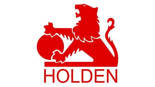
In 1969, the lion was tweaked. The angular, rough mane adopted a more elegant curvy outline. The hair on the paws and the tail gave the animal a more realistic look. And yet, the ends of the paws themselves looked a bit unprofessional – as if the designer had got bored and decided to drop the design as it was and switch to something more interesting.
We should point out that between the original and the 1969 logos, the company used two different logotypes. Both of them were rather cluttered and didn’t feature the lion as the most prominent element.
1994 – 2014
2014 – 2016
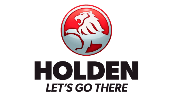 We should also mention the 3D version with the slogan, which was used in 2014-2016. Here, the lion got some depth due to the artistic use of the gradient effect. The typography in this version was different – the letters in the word “Holden” were bolder, heavier, with straight angles. Even the motto “Let’s go there,” which was italicized, looked heavier than the text on the flat version.
2016 – 2019
Eventually, in 2016, the moment came for a sleeker, more minimalistic badge. The new Holden logo dropped the red background in favor of the chrome finish. The type wasn’t that heavy anymore. It adopted a couple of unique details (note the ends of the bars on the “l” and “d,” for instance).
2019 – 2020
The Holden logo was redesigned in 2019, with the iconic symbols getting minimized and flat. The Lion in a circular frame was set in plain black, with just a simple white background behind it. This time the company decided to bring the logotype back, and placed it under the emblem, using a modern sans-serif font with slightly extended title case characters, and some bars are cut diagonally. The inscription was also set in black.
Company overview
Holden is known among the largest Australian automobile importers. Earlier, it used to manufacture automobiles. The company headquartered in Port Melbourne, Victoria, was founded in 1856 as General Motors-Holden.
What does the lion holding a stone mean?
Some sources mention that the stone is a symbol of the steering wheel or it’s not exactly a stone but rather a steering wheel. Here’s the explanation the company gives: the logo alludes to the ancient legend telling that the wheel was invented by a person observing lions rolling stones.


