| Successor | Auto Union AG (1932-1969) Audi NSU Auto Union AG (1969-1985) Audi AG (1985-present) |
| Founded | 1916 |
| Founder | Dr Jørgen Skafte Rasmussen |
| Headquarters | Zschopau, Germany (1906-1932) Chemnitz (1932-1949) Ingolstadt (1949-1969) |
| Products | Automobiles Motorcycles |
| Defunct | 1966 |
DKW is the name of a German discontinued motorcycle and car marque, which was established in 1916 and ceased all operations in 1966. It was one of four companies, which formed the famous Auto Union, the predecessor of the modern Audi brand, in 1932.
Meaning and history
The brand, founded by Jorgen Skafte in 1916, was known as one of the major manufacturers of motorcycles in the world, with its first motorcycle produced in 1919. In the middle of the 1920s, the company started manufacturing cars, and in 1932 it merged with three more German automakers to form Auto Union.
In 1964 Auto Union was acquired by Volkswagen Group, and two years later the DKW brand got discontinued, although in some countries of Latin America the cars under the DKW badge were still produced until 1969.
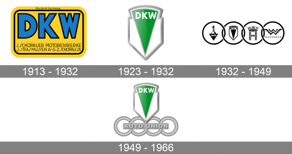
1913 – 1932
The logo, used by the DKW since the birth of the marque and until the foundation of the Auto Union, was set in a bright yellow and blue color palette with lots of additional black lettering. It was a rectangular badge with rounded angles and an interior black outline, with the massive DKW inscription in bold blue capitals of a modern sans-serif typeface. Each of the letters was outlined in black, and the logotype was underlined by a two-leveled inscription.
1923 – 1932
The DKW logo corresponds to the basic rules of heraldry, although it is a very stylized figure: the basis was a classic European “shield” with a sharp base. The only thing in which the creators of the logo allowed themselves freedom is the exit of the main figure outside the shield.
Such a figure was a pointed triangle, on which the abbreviation of the brand itself was placed. The triangle is placed at an acute angle downward, and its upper part, usually the base, rises above the base.
1932 – 1949
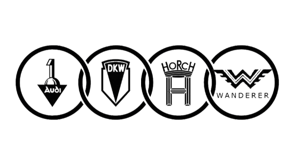
Interestingly, the modern Audi logo began with the merger of four large enterprises – Audi, DKW, Horch and Wanderer.
1949 – 1966
This led to the emergence of a new concern, Audiwerke GmbH, whose logo was four rings, in which the logos of the merged brands were entered. Initially, the rings were composed as if by a chain, but subsequently, in order to facilitate the logo, the contents of the rings were removed, and they themselves seemed to be woven together.
Font
The DKW lettering from the last logo of the German car brand was executed in a strict geometric sans-serif typeface with straight contours and cuts of the lines. The font, closest to the one, used for the DKW inscription is, probably, Flip Fill or Metafora Black Extra Expanded.
Color
The bright and vivid green and silver combination of the last DKW emblem looked fresh and juicy, differentiating the manufacturer from its competitors. Green is the color of growth and wealth, while the silver and white details of the logo added a touch of reliability and professionalism.

