
![]()
| Founded | 1919 |
| Founder | André Citroën |
| Headquarters | Saint-Ouen, France |
| Slogan | “Spirit of avant-garde” “Créative Technologie” |
| Divisions | DS Automobiles |
| Owner | PSA Peugeot Citroën |
| Official Site | www.citroen.com |
| Official Facebook Page | www.facebook.com/Citroen |
Citroen is the famous French brand of the automobile manufacturer, which was established in 1919, and today is owned by Stellantis. The company is one of the European leaders in the production of affordable cars, and has its vehicles exported to countries all over the globe.
Meaning and History
![]()
Andre Citroën launched his auto production only in 1919, having spent some time for development of the logo for his new enterprise.
Today, PSA Peugeot Citroën is the parent company of Citroën. In 1974, the automobile industry company PSA Peugeot Citroën purchased 38,2 % of the Citroën firm’s shares, and by 1976, it brought the ownership interest to 89,95 %. After which the company manufacturing cars Peugeot and Citroën were created.
What cars did the concern produce in the first years of its existence? For a start, it is worth to say that its cars were intended for mass consumption, but therefore its specialists were not strongly worrying with the design. It was rather simple. For the first time, the company stunned the entire world, having produced the innovative Traction Avant, which became the first motor car with the front wheel drive intended for the mass use. Then, the cars beautiful in designer viewpoint began to be produced with enviable regularity.
1919 – 1922
![]()
He selected a double chevron as a logo. Of course, time set a stamp upon the logo. It was modified several times.
1922 – 1932
![]()
The redesign of 1922 kept the original purple and yellow color palette of the badge but slightly changed its composition, placing the chevron, enclosed into an oval on a vertically oriented octagonal banner solid. purple. Both the double chevron and the oval framing were drawn in thick yellow lines. This badge stayed with the brand for six years.
1932 – 1935
![]()
For just one year in 1932, the French company has been using a very ornate rounded logo, with the white swan, facing to the left, set under the double chevron in gold. The composition was enclosed into a circular gold frame, with the peak of the chevron overlapping it on top. Under the swan there was a dark blue element, symbolizing the water, with some thin white lines, and a turquoise two-leveled “Moteurflottant Citroen” inscription.
1935 – 1959
![]()
The redesign of 1935 brought Citroen the new badge, which has been used by the brand for the next twenty years. It was an emblem, based on the one from 1922, but with the purple shade becoming bluer, and the octagon gaining the double yellow and blue outline. The uppercase Citroen logotype was now set on the badge, under the chevron, and used a lightweight sans-serif typeface for its capital letters.
1959 – 1966
![]()
In 1959 the French automaking company introduced a new logo, with two sharp chevrons drawn in a three-dimensional way, with two shades of yellow, and a thin, barely visible gray contour of the horizontally oriented oval. The contour was overlapped by the massive chevrons both on top and bottom.
1966 – 1985
![]()
The two chevrons kept their style and color palette but got placed on a new banner with the redesign of the Citroen logo in 1966. They were now set on a plain white oval, placed on a solid blue square above the white rectangle with the blue logotype, written in the uppercase of a modern and strict sans-serif typeface. The square was outlined in yellow, balancing the colors of the chevrons.
1985 – 2009
![]()
The redesign of 1985 has brought a new color palette to the Citroen logo and made it more laconic and model, The new composition featured a small red square with two flat white chevrons on it, set above the enlarged black logotype, written in the uppercase of a bold and strong sans-serif typeface, with clean contours and straight cuts of the lines.
2009 – 2016
![]()
In 2009, the chevron was pulled out of the frame to achieve the volume of the logo, stakes on content, power and freedom.
2016 – 2019
![]()
In 2016 the Citroen logo got another redesign, being redrawn in a flat style, with the use of just one color — light gray. All the elements kept their shape and placement, but in a new minimalistic manner, everything started looking different. The light-gray badge with two smooth chevrons, set above the custom lettering, looked futuristic and sleek.
2019 – 2022
![]()
The Citroen logo redesign of 2019 has created a stronger and cleaner version of the previous emblem by switching the shade of gray to a darker one, and slightly playing with the size of the emblem, compared to the logotype, which remained unchanged. Overall, the new badge looked progressive, stylish, and strong.
2021 – 2022
![]()
In 2021 the badge of the company was redesigned again, with the lettering getting the main part of it. The heavy uppercase inscription was set in black against a white background, with the ExtraBold characters following a delicate black emblem, composed of two chevrons, set on the left of the logotype.
2022 – now
![]()
In 2022 the company decides to come back to one of its past badges, with the two clean triangular chevrons enclosed into a vertically-oriented oval frame. But this time the whole composition is set in monochrome, and the lettering, written under the emblem, is executed in a fancy custom typeface with sleek contours of the characters.
Font
The sleek futuristic Citroen logotype, set in the mixed-case, is written in a custom typeface, which was designed specifically for the brand. The closest commercial font to the one used in the French automaker’s insignia is, probably, Ordin Rounded.
Symbol

The symbol of Citroën is a schematic image of the chevron wheel teeth. The chevron wheel is a gear with V-like teeth (such structure of teeth resolves the problem of axial power, the need of installation of shafts on thrust bearings disappears while using a chevron wheel).
In 1913, Andre Citroën organized the production of such gears, which significantly exceeded the production of competitors. It explains the choice of the emblem.
Colors
![]()
The chrome chevrons of the Citroën logo turn into its action-packed and vivid image. The simultaneous use of red tint, on the other hand, shows the enthusiasm, vigor and business responsibility of the company.
Emblem
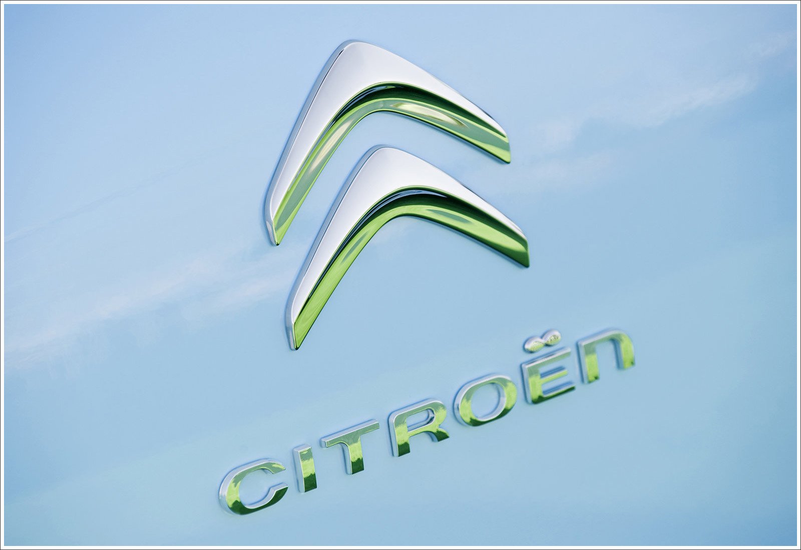
The Citroën emblem uses a custom-made type of letters. The modern emblem was designed by the well-known San Francisco branding agency Landor Associates. It represents a 3D version of the original logo, which depicts less sharp chevrons in a sleek chrome finish.
![]()
What are prospects of the brand development? In 2015, a notable increase of sales of cars Citroën in the market of the People’s Republic of China was marked, and both companies, Peugeot and Citroën entered the top-10 list of the most successful car brands in Europe.
![]()
The DS brand belonging to the PSA Peugeot Citroën Company for the first time started to be sold as the separate premium-make.
The company expects the car market to rise in 2016 by 2% in Europe and by 5% in China, while in the countries of Latin America it will fall by 10% and in Russia – by 15%.
At the beginning of 2017, a completely new minivan Citroёn SpaceTourer will be represented.