| Founded | 1919 |
| Founder | Carl F. W. Borgward |
| Headquarters | Bremen, Germany |
| Official Site | www.borgward.com |
| Official Facebook Page | www.facebook.com/borgward.official |
Borgward is a unique phenomenon of the German automotive industry of recent times. The brand, which ceased to exist in 1963, literally rebounded at the Munich International Motor Show in 2015, literally rebounded from non-existence, and even with a new logo.
Meaning snd History
The updated logo is a diamond-shaped geometric design consisting of four triangles arranged in checkerboard pattern. The colors of the triangles – red and white – represent a symbolic reference to the flag of Bremen (the city in Germany where the revived company is located), and also, in part, to medieval theaters and dominoes. The main color of the logo is white or silver, which symbolizes in heraldry the desire for the future and an unblemished reputation.
The name of the brand, according to the established tradition, is favorably placed in the center of the composition, and is a unified font of black color, placed on a silver background.
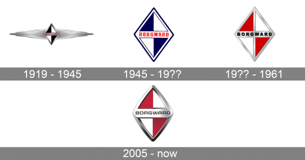
1919 – 1945
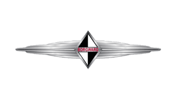
The original Borgward logo, introduced in 1919, featured a bright and modern for its times emblem, composed of a geometric emblem, enclosed into two horizontally stretched wings, and lettering, set on a delicate banner across the central part. The main emblem features a vertically oriented rhombus divided into four equal segments in black and white. As for the wordmark, it was set in red capitals of a clean sans-serif font.
1945 – 19??
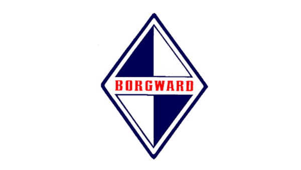
In 1945 the Borgward logo gets its first redesign, with which the exaggerated wings were removed, and the color palette of a rhombus was switched to blue and white. The geometric figure now gained a double blue and white outline, and the red lettering changed its typeface to a bold and elegant serif one, with rectangular contours of the characters.
19?? – 1961
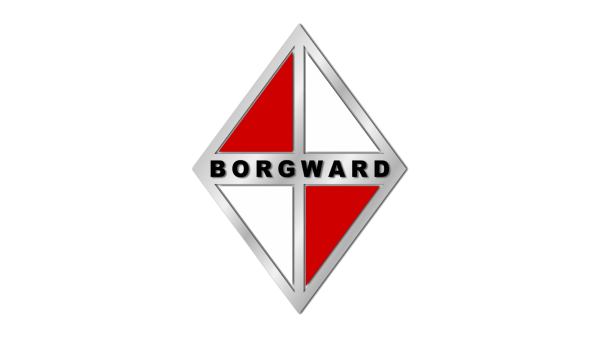
The next redesign modernized and refined the Borgward badge, executing it in a light silver, white and red color palette, and making it three-dimensional. The red and white rhombus and had all the separation lines and framing in silver metallic, and the lettering changed its color to black, and its typeface to a modern and stable sans-serif, which added a touch of professionalism and confidence.
2005 – now
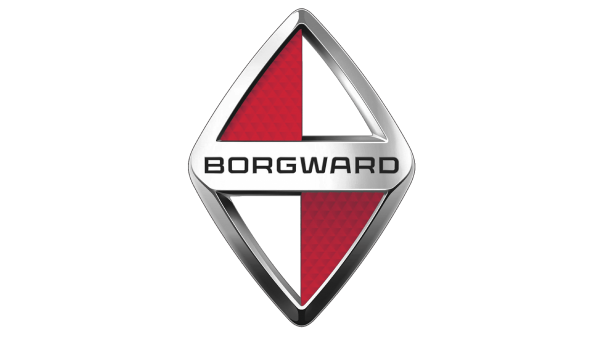
With the rebirth of the auto marque in 2005, the new logo of Borgward was introduced in the same year. The composition repeated the previous badge, from the middle of the 20th century, but all the lines and colors were modernized. The rhombus was vertically extended and got all its contours softened and emboldened. The thick metallic frame gained slightly darker gradients, while the red parts of the emblem got a carbon pattern, with coming darker triangular all over. The lettering changed its typeface to a more modern and sleek one, keeping black in color for its characters.
Color
Since the beginning of the 20th century, Borgward has been using a sleep black, white, and red color palette, which symbolized power, style, and expertise. Although the colors changed places throughout the years, the main shades remained untouched.
Font
The modern and unique Borgward logotype from the official badge of the automaker is executed in a custom sans-serif typeface with wide contours of the letters and softened angles. The closest fonts to the one used in this insignia are Protrakt Variable Bold-Exp-One and The Ruby Sans Extra Exp Semi Bold.

